-
By Abhyudaya Tripathi

-
 07 May, 2020
-
 ~ 19 minutes to read
07 May, 2020
~ 19 minutes to read
Did you know how many people search on Google using their mobile devices?
If not, then here is the statistic.
Mobile searches on Google constitute 58% of all searches.

The fast-growing rate of mobile searches makes it essential for webmasters and other businesses to optimize their sites for mobile devices.
Mobile users are accumulating a major portion of website traffic, leads, and conversion rate.
But this will only happen when you know how to do mobile SEO in the right way.
And what are the mobile SEO techniques and tricks you need to implement?
In this article, you’re going to learn:
So let’s get started.
Mobile search engine optimization is the process of optimizing your site to attract and serve mobile users. This means providing an outstanding experience to mobile visitors.
In the past webmasters, optimize their websites for desktop users only. But nowadays, the faster-growing rate in mobile devices makes it important to optimize your site for mobile also.
The importance of mobile search engine optimization can’t be ignored. With everyday passing mobile SEO is becoming an integral part of online business and marketing.
Look at some of the statistics regarding SEO for mobile sites that illustrate its importance more compellingly.
You can analyze from these statistics how much it is essential to make your site mobile-friendly.
Google mobile-first index has the same meanings as it sounds. It means Google gives priority to mobile-optimized pages for ranking and answering the user search query.
In past days Google used the desktop version of the site pages for ranking and indexing. The mobile version was considered an alternate version of that site.
But mobile searches in the past few years are drastically increasing. So Google now considers the mobile version of a site as the base for ranking and indexing.
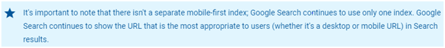
This doesn’t mean that the desktop version will not be included in the index if you don’t have a mobile-optimized version. Here is what Google says about it.
The only problem with not having a mobile version is losing your site ranking. While on the other hand, sites with excellent mobile user experience get a ranking boost.
From first July 2019, mobile-first indexing is enabled by default for all the sites new to Google.
Now it’s time to optimize your website for mobile SEO. Here you learn mobile SEO strategy, tips and tricks that help you in making a mobile-friendly site.
The first step to making your site mobile-friendly is choosing a type of configuration. There are three main configurations you can use on your website that includes responsive design, dynamic serving, and separate URLs.

Source: Developers.Google
Let’s explain each one of them in detail…
Responsive web design is the first and most recommended mobile configuration by Google. It uses the same URL and HTML code for displaying web pages to users irrespective of a user’s device.
This means both versions (desktop and mobile) of your site use the same CSS, images, and JavaScript for the type of browser and device of a searcher.
But still, there are some pros and cons of using responsive web design.
Pros
Cons
But considering all these benefits and challenges responsive web design is still a good option.
Dynamic web design uses the same URL for both desktop and mobile devices but sends different HTML codes to each device.
Here when a user searches any query, then the browser responds with different HTML and CSS files based on the user’s device. This means it uses two HTML pieces for a single webpage.
But it is still not recommended by Google. Here is what Google says about it.

Pros
Cons
This is the third option if you want to configure your site for mobile users. In this configuration, the server responds to user queries with different URLs and HTML codes, depending on a user’s device.
For example, if a user searches from a mobile device, the server will show him a page with a mobile URL, usually, m.example.com. While if a user searches from the desktop site, the server will show him a page with a desktop URL usually www.example.com.
Google doesn’t recommend this configuration because Google bots need to do extra work and crawl two websites instead of one.
Pros
Cons
But Google doesn’t recommend it. Here is what Google says.

Site speed is a critical factor in getting a higher ranking. Your site needs to have an optimal loading time. If it takes longer to load, then Google will drop its ranking like a stone.
According to Backlinko an analysis of 5.2 million web pages found that there is 1.286 seconds loading time for desktop sites and 2.594 seconds for mobile sites. There is a difference of 87.84% in loading time.
But you must keep your site speed faster for giving your mobile users an excellent experience.
According to Google’s mobile page speed research with every extra second, a site takes to load will increase bounce rate very fast.

This makes it essential for individual webmasters, companies’ sites, and other online shopping site owners to take care of the site’s loading time on mobile devices.
The title tag appears in the search engine results when you search for any query.

It is an essential part of your mobile SEO optimization like on desktop. Your title tag is a headline that appears in search results and should be optimized.
According to Backlinko, Google displays longer titles on mobile devices fine while it may shorten title tags on the desktop if it is longer.
While on the other hand, Meta descriptions have a reasonable length of 155 characters.
But keep your Meta description meaningful because it determines how much your page gets clicks. And Google ranks those pages high that get lots of clicks.
An analysis of 5 million pages from Backlinko, shows that pages with meta descriptions get 5.8% more CTA.
Content readability is the one thing that matters a lot more when you optimize your site for SEO for mobile devices.
The reason is the smaller screen. If your content is difficult to read then users will immediately press the back button and leave your site.
Here are some tips and tricks you can implement.
For enhancing readability, you can use short sentences, and short paragraphs up to no more than 2 to 3 sentences.
Another important thing is font size because if your content font size is small, then users need to zoom your content for better readability. So it is better to keep your font size bigger.
Sometimes videos that you use for desktop pages are unable to play on mobile devices and give an error like this one.

It is also called unplayable content. It occurs usually when you use flash, a video player, or any other unsupported format that can’t play on mobile devices.
According to Google web developer’s guidelines, you use HTML5 standard tags for videos and animation content. Also, use HTML5 animations, which easily work on all browsers.
In the past, webmasters made their JavaScript, CSS, images, and other related files hidden from search engine crawling. This was done for enhancing their site speed and for a better user experience.
But now things have changed and it is not appropriate for your website. Google doesn’t recommend it. When you block them, Google bots will be unable to fully crawl and understand your entire site. And it can result in suboptimal ranking.


Source: Google webmaster
Popups are excellent for capturing leads by getting a visitor’s attention. A study analyzed over 1.75 billion popups, and they found that popups have an average conversion rate of 3.09%. Which shows how effective they are?
Popups are usually used to show up apps, and services or gain email signups.
But for mobile devices where the screen dimensions get smaller, it is better to avoid interstitials that cover the screen partially or in full.
When they are used in such a way on mobile sites, then users get frustrated. Sometimes users get difficulty hiding them.
Here is what Google says, “Pages where content is not easily accessible to a user on the transition from the mobile search results, may not rank as highly.”
So what do you use instead?
Here are the three types of alternatives Google recommends.
For reading more about it click here.

Source: Optinmonster
It is a space between text, design elements, and other buttons on a page such as a call to action buttons. It is essential to have negative space on mobile-optimized pages because it will enable users to easily click whatever icon they want. In the above image, Optinmonster uses negative space between the elements on their landing page.
We all know that social media icons are important for web pages. They help you get social shares from visitors and as a result, bring traffic to your site.
Usually, you use social media icons as a sidebar, and visitors quickly click it and share. Here is an example from Semrush having social media icons in the sidebar.
But on mobile devices, it is not possible. In this case, the most effective way is to use them at the bottom of a webpage. Here is a Backlinko mobile page image. And you can see how awesome social media icons look.
Source: Backlinko
It stands for accelerated mobile pages. It is developed by Google and it helps webpages to load fast. Google displays an icon with pages that use AMP which helps the searcher to identify pages that load faster in a smooth way.

Source: WPbeginner
But Google has cleared that AMP is not directly a ranking factor, but instead, speed is a ranking factor. And speed is enhanced when you use AMP.
Structured data refers to a code that is used to tell the search engine what the page is about. It is a standardized format that gives information about the page and also classifies it. It is used like this.

Google uses this structured data to display the page with rich snippets. Here is an example.

You can do this with the help of schema.org. It is a community whose mission is to create, maintain, and promote structured data.
For desktop optimized pages webmasters usually use large images on top of site pages. They appear usually after the headline. But that is good because the desktop has a large screen and the user didn’t get annoyed by it.
But it is not the case with mobile-optimized pages where users want to get information quickly. So it is better not to use any header images or use small header images and give your user a good view of your pages.

Redirects mean referring a user to another page. Redirects are usually used when you have separate URLs configuration.
You need to redirect the desktop URL to the appropriate mobile URL. But avoid faulty redirects like redirecting a desktop user to any irrelevant page on a mobile site. Here is an image for a more in-depth illustration.

Source: Developers.Google
The same case is with crosslinks. Crosslinks refer to linking between two sites. Here what happens you link your site page to the relevant page on another website. So it’s important to link to relevant pages. It is not appropriate to link from desktop page point to the homepage of mobile websites.
Sometimes you visit a page from the desktop device, and it serves you normally. But when you visit the same page from a mobile device or any other, it shows 404 errors.

It usually appears when your visitor gets the same desktop URL on the mobile device. So when you have different mobile sites and desktop sites, then it is good to redirect the user to relevant mobile URLs.

And along with that Google recommends you must check that the mobile page itself is not an error page.
Local searches on mobile devices are increasing from the past few years.
According to a study, local searches increased by 500% in the past few years and the conversion rate is 80% for local searches.
So it is important to optimize mobile sites for local search strings. You need to add your city, town, add your products and services, and location as well. For reading more about how to optimize for local SEO services.
Click here: How To Make The Most Out Of Local SEO In 2021.
Whenever you’ve separate URL configuration then using rel=“alternate” and rel=“canonical” tags are important. What these tags do is tell Google where the corresponding page is located.
You use rel=“alternate” on a desktop page pointing to the corresponding mobile URL. It tells Google where the related mobile page is located. On the other hand, you use rel=“canonical” on a mobile page pointing to a desktop URL. It tells Google where the desktop version of the mobile page is located.
HTML codes for both the tags for desktop use and mobile use are as follows.
For the desktop version, you use the following annotation.

While on mobile sites, you use this annotation.

When you’re using dynamic serving, then vary: user-agent HTTP header is an important tag you need to use. It tells Google based on the type of device that page to show to the user.
This means if a user is searching from mobile, then the HTTP header tells Google that there is an alternative page for a mobile device. And if the user is searching from the desktop then it helps Google to show him a desktop optimized page.
If you don’t use it, then Google may show the desktop page by default to the mobile user. It is not appropriate and can decrease your ranking.
Here is an image that will show you how it works. As part of the server, it responds to user requests like this.

When you’re using responsive web design, then the use of a viewport tag comes into place. It tells the browser about scaling and adjusting the page according to the length and width of the user device.
This means the browser will show the desktop optimized page at desktop screen width while mobile-optimized at mobile screen dimensions. But if you don’t use it, browsers may adjust the page at desktop dimensions on the mobile device that will surely harm your rankings.
Google recommends that you use the viewport tag with the following content.

Tools and tests play an important role in making a site mobile-friendly. They also tell you about errors and suggestions for improvements. Therefore it is essential to use them. Here is a list of some tools and tests that help you in this journey.

This tool is a product of Google, and it tells you how much users can easily use your site on their mobile device. Here you need to put your site URL and press enter. It then shows you whether your site page is mobile-friendly or not. You can also view the mobile usability report.

This tool gives you information about your site’s desktop and mobile page speed. It also gives you suggestions that you can implement to improve site performance. For using it, you need to put your site URL in the search bar and it shows you results for both the mobile as well as a desktop devices.

It is a new webmaster tool introduced by Google. Here you put your site URL and Google bot index it. So if you have a mobile site, you can check some pages by submitting a URL to fetch as a Google tool, and it will tell you how Google sees your site pages. You can scroll your pages to see if anything is missed by Google or not. But remember not all the pages submitted are indexed.

Using schema.org, you can create and use structured data for your site. Structured data tells the search engine what the page is about. It consists of a code that the search engine uses to understand a page.

Sitemaps are important for mobile devices. They help you to differentiate mobile pages from desktop pages and so Google can easily index your important pages in a better way. It also helps Google to understand your site structure. With XML sitemaps you can easily create sitemaps for your website by entering your site URL.
It is true that mobile optimization can play a huge role in getting traffic, leads, and conversions. You can’t ignore mobile SEO at any price if you want to be successful in the SEO services industry. Mobile SEO is not difficult if you follow its techniques in the right way.
I think you enjoyed this article and find this information valuable. Now it is time for you to put this knowledge in practice and make your site mobile-friendly as soon as possible.
Which technique did you like? Please share in the comment section.
Also Read: How to Optimize Your Website for Mobile Audience?
Our Pay for performance SEO programe helps companies
achieve impressive results