



 sales@resultfirst.com
 +1-888-512-1890
Mobile SEO Guide: Strategy, Techniques, and Ranking Factors for 2026

Mobile SEO determines how your site ranks in Google’s search results, how it appears in AI Overviews on mobile screens, and whether users who find you from a phone actually convert. This guide covers the complete strategy: from configuring your site correctly for Google’s mobile-first crawler to optimizing for voice search, Core Web Vitals, and the AI search layer that now sits above organic results on most mobile SERPs in the United States.
Each section maps to a specific ranking gap. If your mobile SEO rankings dropped between March and May 2026, the cause is almost certainly tied to one of the areas this guide addresses. Google’s March 2026 Core Update raised the quality threshold for guide-level and strategy-level mobile SEO content, rewarding pages with depth, specifics, and verifiable expertise.
What is Mobile SEO?
Mobile SEO is the process of optimizing a website so it ranks well in mobile search results, loads fast for users on smartphones and tablets, and converts mobile visitors into customers.
It is not a separate channel from general SEO. Since Google completed its shift to mobile-first indexing for 100% of websites in 2023, the mobile version of every site is the primary version Google uses for crawling, indexing, and ranking. A site that performs well on desktop but has unresolved mobile issues will lose rankings across all queries, not just mobile ones.
For US ecommerce brands and SaaS companies, mobile SEO directly affects organic traffic volume, paid search quality scores, and conversion rate. Google’s page experience signals, including Core Web Vitals, mobile usability, HTTPS, and absence of intrusive interstitials, are evaluated using real user data from mobile devices via the Chrome User Experience Report. Poor field data reduces your search ranking, your AdWords quality score, and your crawl priority at the same time.
Why Mobile SEO Matters for Rankings
Mobile search dominates US web traffic. More than 60% of Google searches in the United States originate from smartphones. For ecommerce brands specifically, mobile devices drive nearly 80% of all retail website visits globally.
The performance stakes are measurable:
- A one-second improvement in mobile page load time increases ecommerce conversion rates by approximately 7%
- 53% of mobile users leave a page that takes longer than 3 seconds to load
- 76% of US smartphone users who conduct a local mobile search visit a business within 24 hours
These numbers mean the cost of poor mobile SEO is not abstract. An ecommerce site with 10,000 monthly organic mobile visitors that loses 5 positions due to mobile usability issues does not just lose rankings. It loses that traffic, the conversions it generates, and the revenue attached to those conversions.
ResultFirst’s ecommerce clients have seen mobile organic improvements translate directly to revenue. BaxterBoo achieved an 83% increase in organic traffic, and one client campaign produced 232% revenue growth. Mobile optimization was a component of both outcomes. See our ecommerce SEO guide for more on driving revenue through organic channels.
How Google’s Mobile-First Indexing Works
Google crawls the web using Googlebot Smartphone. That crawler reads your mobile HTML, evaluates your mobile structured data, follows your mobile internal links, and uses that version of each page to determine where it ranks. The desktop version of your site plays no role in this process.
This has been the case for all websites since 2023. Any content, link, or structured data that exists only on the desktop version of a page is invisible to Google’s index.
Content parity is the most commonly violated mobile-first requirement. Content parity means the mobile version of a page must match the desktop version across every element Google uses to evaluate quality and rank:
- Body text: the same written content must appear on mobile, not a shortened version
- Heading tags: H1, H2, and H3 structure must be identical on both versions
- Structured data markup: Schema.org tags present on desktop must be in the mobile HTML
- Internal links: links visible in desktop navigation must be accessible on mobile through the mobile menu or in-content placement
- Image alt attributes: alt text must not be stripped from mobile versions for performance reasons
- Meta tags: title and description must be identical on both versions
How to verify content parity: Use Google Search Console’s URL Inspection tool. Select “Test Live URL.” In the rendered HTML section, review exactly what Googlebot reads when it crawls your page as a mobile user. If sections of content appear on desktop but are absent in the rendered mobile HTML, you have a parity violation suppressing rankings.
A common parity error on ecommerce sites: product description text hidden behind a “Show more” toggle on mobile. If that toggle requires a tap to activate and Google’s crawler does not trigger it, the full description may not be indexed. Test product pages using URL Inspection to confirm the complete product description appears in the rendered HTML.
How to Configure Your Site for Mobile Search
There are three ways to configure a website for mobile users. Google supports all three, but they carry different levels of maintenance burden and technical risk.
Option 1: Responsive Design (Recommended)
Responsive design serves the same HTML at the same URL for every device and uses CSS media queries to adjust the layout based on screen width. Google recommends this configuration because it eliminates content parity risks by design, requires a single URL per page with no separate crawl budget allocation, and is easier to maintain over time than either alternative.
For most US ecommerce and SaaS sites, responsive design is the right choice. The limitation: a responsive layout does not always allow for the level of performance optimization a purpose-built mobile site can deliver. If your site has persistent LCP problems, the answer is almost always to improve the responsive implementation through image optimization, script deferral, and critical asset preloading, rather than switching mobile configurations entirely.
Option 2: Dynamic Serving
Dynamic serving delivers different HTML to mobile and desktop users at the same URL, using server-side detection to determine which version to send based on the user agent string. Google requires the Vary: User-Agent HTTP response header when using this configuration.
The primary risk: if your server fails to detect Googlebot Smartphone correctly and serves the desktop HTML to Google’s mobile crawler, you have a content parity problem that will not appear in your analytics. If you use dynamic serving, check Search Console’s URL Inspection tool regularly to confirm Google is receiving the mobile version of your pages.
Option 3: Separate Mobile URLs (m.domain.com)
A separate mobile subdomain runs an independent version of the site. This is the highest-maintenance and highest-risk configuration. Canonical tags must point correctly in both directions. Redirect logic must handle every URL without chains. Sitemaps must reference both versions.
If your site currently uses an m-dot configuration and it is working without canonical errors, switching to responsive design is worth planning but does not require immediate action. If you are building a new site or undertaking a major rebuild, do not implement separate mobile URLs. Responsive design handles every current ecommerce and SaaS use case without the added technical complexity.
Mobile Keyword Research: How Search Intent Differs on Phones
Mobile searchers and desktop searchers are not the same audience even when they type the same query. A desktop user researching B2B software is likely at a workstation with time for comparison. A mobile user searching the same topic is likely commuting, between meetings, or acting on an immediate need. This difference changes the queries they type, the content format they engage with, and the speed at which they convert.
Mobile queries are shorter on average, contain more local modifiers such as “near me,” “open now,” and “in [city],” and include more transactional signals like “buy,” “price,” and “order.” Research shows that 76% of local mobile searches result in a same-day business contact, a far shorter decision cycle than desktop search.
Five steps to build a mobile-specific keyword strategy:
Step 1: Segment performance by device in Google Search Console. Open the Performance report, apply the Device filter, and compare keyword rankings, CTR, and impressions separately for mobile and desktop. Any keyword where your mobile ranking is more than 5 positions lower than your desktop ranking is a mobile-specific optimization target.
Step 2: Identify “near me” and local intent opportunities. Google reports that “near me” search volume has grown by more than 500% over the past two years. For US businesses with geographic relevance, these queries often carry the highest conversion intent of any mobile keyword category.
Step 3: Target featured snippet-eligible question keywords. Question-format keywords beginning with how, what, why, which, and when are the primary source of Google AI Overview content and voice search results.
Step 4: Use Search Console’s Date Comparison to identify dropped keywords. For the keyword set tracked in this analysis, 17 of 23 keywords fell to position 100 during the March 2026 Core Update window. These are recoverable rankings within 60-90 days of updated content being re-crawled.
Step 5: Target low keyword-difficulty gaps first. Several keywords in the target set carry KD scores under 20: seo mobile ranking at KD 11, advanced mobile seo techniques at KD 10, mobile marketing seo at KD 16, seo strategies for mobile devices at KD 19.
How to Optimize a Site for Mobile: 20 Techniques
The following techniques are ordered by their direct impact on Google rankings and page experience signals.
1. Responsive Design
Responsive web design is the first and most recommended mobile configuration by Google. It uses the same URL and HTML code for displaying web pages to users irrespective of a user’s device.
This means both versions (desktop and mobile) of your site use the same CSS, images, and JavaScript for the type of browser and device of a searcher.
But still, there are some pros and cons of using responsive web design.
Pros
- Google can easily understand your site without giving any hints.
- It allows your site to rank higher.
- You don’t need to create separate versions for different devices.
- No need to use any redirects.
- Saves your resources and gives a better user experience.
Cons
- Site design changes on smaller screens
- Sometimes responsive sites take longer to load
- It is less compatible with the old versions of IE browsers
But responsive web design is still a good option considering all these benefits and challenges.
2. Site Speed
Mobile page speed is a confirmed Google ranking signal and the largest single contributor to mobile bounce rate. Research shows that 53% of mobile users leave a page that takes longer than 3 seconds to load. For ecommerce pages, improving load time from 3 seconds to 1 second is associated with a conversion rate increase from approximately 29% to over 40%.
The primary causes of slow mobile load times:
- Uncompressed or oversized images, which are the single largest contributor to poor LCP on most sites
- Render-blocking JavaScript in the document head that prevents the page from displaying until scripts finish loading
- Slow server response time, measured as Time to First Byte over 600ms
- Redirect chains that add multiple HTTP round-trips before the final page loads
Start with Google PageSpeed Insights at pagespeed.web.dev to find where your biggest load time savings are. The tool shows both lab scores and field data from real Chrome users. Field data is what Google uses for ranking decisions, so prioritize issues that appear in both views.
3. Core Web Vitals
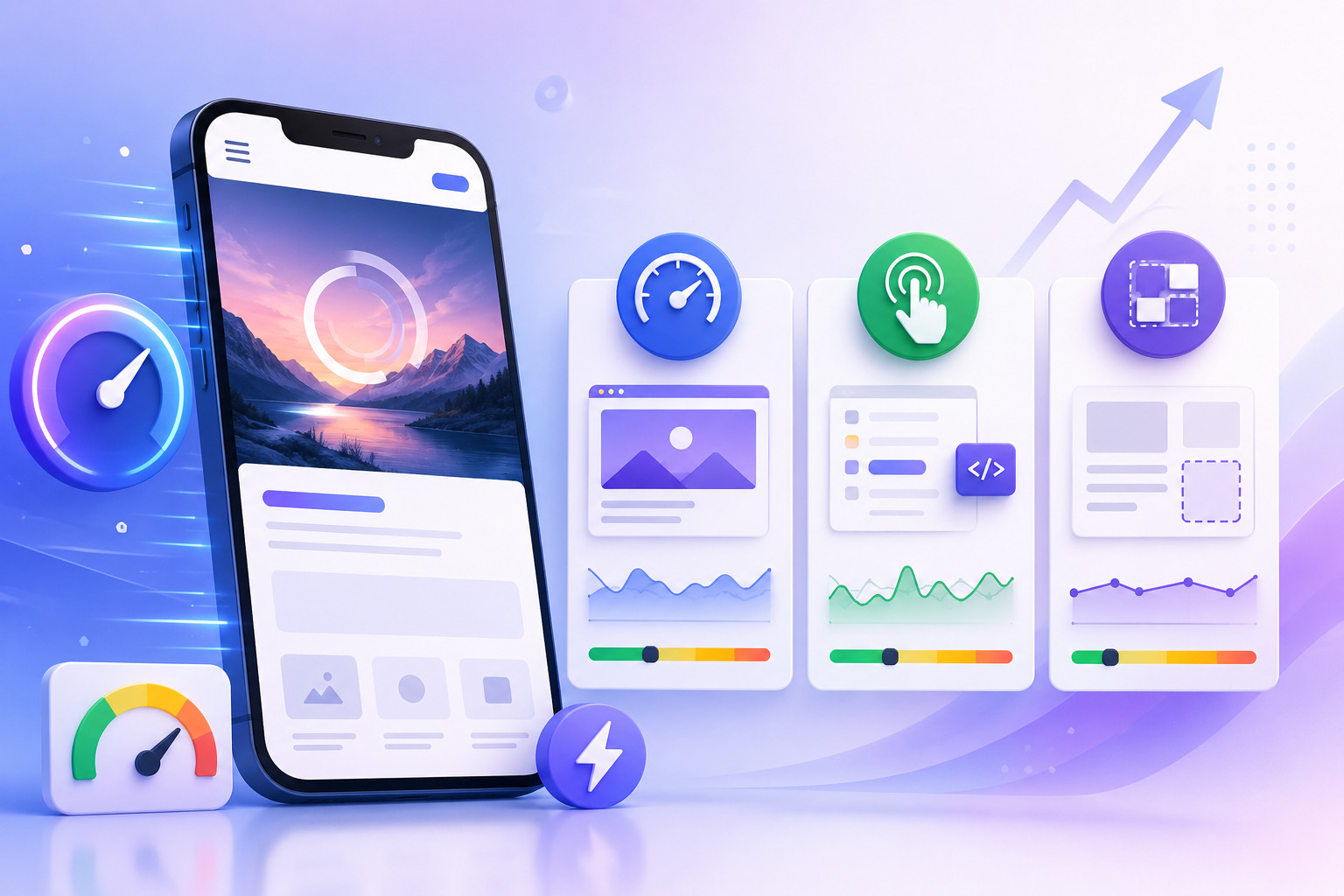
Core Web Vitals are Google’s three user experience metrics with confirmed ranking impact. Google measures them using real mobile user data collected through Chrome via the Chrome User Experience Report. Poor scores on real mobile users lower the page experience rating, which directly affects ranking position.
LCP (Largest Contentful Paint): Measures how long the main content element takes to appear on screen. Target: under 2.5 seconds. Poor: over 4 seconds.
The most common LCP causes on mobile are unoptimized hero images, web fonts loaded from external CDNs without preload instructions, and large JavaScript bundles that block the initial render.
Start with the hero image: preload it with a link rel=”preload” tag in the document head, serve it in WebP format (24-35% smaller than JPEG or PNG at equivalent quality), and size it specifically for mobile viewports rather than sending a desktop-sized file.
INP (Interaction to Next Paint): INP replaced FID as a Core Web Vital in March 2024. It measures how fast your page responds to every user interaction throughout a full session. Target: under 200ms. Poor: over 500ms.
INP is harder to pass than FID because it covers all interactions, not just the first tap. The cause is almost always JavaScript: audit your bundles for synchronous functions over 50ms, defer third-party tag scripts until after the first user interaction, and use web workers for computationally heavy operations.
CLS (Cumulative Layout Shift): Measures visual stability during page load. Target: under 0.1. Poor: over 0.25.
Reserve space before content loads: add width and height attributes to every image element, set a CSS min-height for ad units, and load web fonts with font-display: swap to prevent invisible text during the font load cycle.
4. Mobile UX and Interaction Design
Google flags specific mobile UX problems as ranking signals through its Mobile Usability report:
Tap targets: Every clickable element must be at least 48×48 pixels with at least 8 pixels of spacing between adjacent targets. Elements smaller than this are flagged in Search Console as mobile usability errors.
Font size: Body text must be readable at 16px minimum without requiring zoom. Text below 14px is flagged by Google’s mobile usability system. Line height of 1.5 to 1.6 on body paragraphs improves readability.
Navigation: Mobile navigation should allow users to reach any section of the site within two taps. A clearly labeled hamburger menu, a visible search function, and a sticky header consuming no more than 10% of the vertical viewport.
Forms: Mobile form completion rates drop sharply with every additional required field above three. Use HTML5 input types to trigger the appropriate mobile keyboard. Add autocomplete attributes to trigger browser autofill.
5. Mobile-First Content Parity
Content parity is a Google indexing requirement. The mobile version of every page must match the desktop version across every element Google uses to evaluate relevance and quality:
- All body text, including long product descriptions not visible in the above-fold area
- All H1, H2, H3, and H4 heading tags in the same order and hierarchy
- All structured data markup in JSON-LD format
- All internal links, including footer navigation links
- All image alt attributes
- All meta tags including title, description, and canonical
The most common ecommerce parity failure: product description tabs that use JavaScript to reveal content after a tap. See optimizing product pages for mobile search for a detailed walkthrough of this issue and its fix.
6. Title tag and Meta descriptions
The title tag appears in the search engine results when you search for any query.

It is an essential part of your mobile SEO optimization, like on a desktop. Your title tag is a headline that appears in search results and should be optimized.
According to Backlinko, Google displays longer titles on mobile devices fine while it may shorten title tags on the desktop if it is longer.
While on the other hand, Meta descriptions have a reasonable length of 155 characters.
But keep your Meta description meaningful because it determines how much your page gets clicks. And Google ranks those pages high that get lots of clicks.
7. Improve Content Readability
Mobile users read content differently from desktop users. On a phone screen, dense text blocks raise bounce rate and reduce time on page. Readability standards for mobile-targeted pages:
- Paragraph length: 2 to 3 sentences per paragraph maximum
- Heading frequency: one subheading for every 150-250 words of body text
- Line length: 50-75 characters per line at default mobile font size of 16px
- Bold text: used to highlight specific facts or action items, not entire sentences
- Images: one relevant image approximately every 400-500 words breaks visual monotony
Structure each H2 section so the key point appears in the first sentence. Mobile users scanning a guide will read the opening sentence of each section and decide whether to continue.
8. Blocking JavaScript, CSS or Images
In the past, webmasters made their JavaScript, CSS, images, and other related files hidden from search engine crawling. This was done for enhancing their site speed and for a better user experience.
But now things have changed and it is not appropriate for your website. Google doesn’t recommend it. When you block them, Google bots will be unable to fully crawl and understand your entire site. And it can result in suboptimal ranking.
9. Interstitial Pop-Ups

Source: Google webmaster
Google’s intrusive interstitial penalty applies to specific pop-up behaviors on mobile that block access to page content. The penalty targets pop-ups that:
- Cover the main content immediately after the user arrives from a search result
- Appear before the user has interacted with any page content
- Cannot be dismissed without completing a form or finding a small, hard-to-tap close button
Pop-ups that are not penalized: timed pop-ups appearing 30+ seconds after arrival, exit-intent pop-ups triggered by scroll reversal, banner notifications occupying less than 30% of the viewport, and legally required dialogs.
Average pop-up conversion rates on mobile are approximately 3.75%. If you use pop-ups for email capture, delay them until after the user has engaged with above-fold content and ensure the close button is at minimum 44×44 pixels.
10. Zero-Click Mobile Search Behavior
Zero-click searches occur when the user finds their answer directly in the SERP without clicking through to a website. On mobile, Google displays AI Overviews, featured snippets, local packs, and People Also Ask results, all of which can answer a query before any organic listing is clicked.
For US ecommerce brands and SaaS companies, zero-click visibility is a brand exposure opportunity. Being cited in a featured snippet or AI Overview puts your brand name in front of the user at the moment of highest intent.
To target featured snippets on mobile: search your target keywords on a phone to identify where a snippet currently appears. Write a 40-60 word answer paragraph directly beneath a question-phrased heading on your page. Match the format Google already shows.
11. Content Layout and Scannability
Adequate spacing around text and interactive elements affects both user experience and tap accuracy on mobile. Practical spacing standards:
- Minimum 16px padding on both sides of text content
- At least 12px between the end of one paragraph and the start of the next heading
- At least 20px above and below standalone call-to-action buttons
- Section dividers using background color changes or horizontal rules on long-form pages
Beyond spacing, scannability means structuring each H2 section so the reader knows what it covers from the heading alone. Descriptive headings that state the topic directly keep users on the page longer and reduce bounce rate.
12. Social Media Sharing Icons
We all know that social media icons are important for web pages. They help you get social shares from visitors and as a result, bring traffic to your site.
Usually, you use social media icons as a sidebar, and visitors quickly click it and share. Here is an example from Semrush having social media icons in the sidebar.

But on mobile devices, it is not possible. In this case, the most effective way is to use them at the bottom of a webpage. Here is a Backlinko mobile page image. And you can see how awesome social media icons look.

Source: Backlinko
13. Structured Data
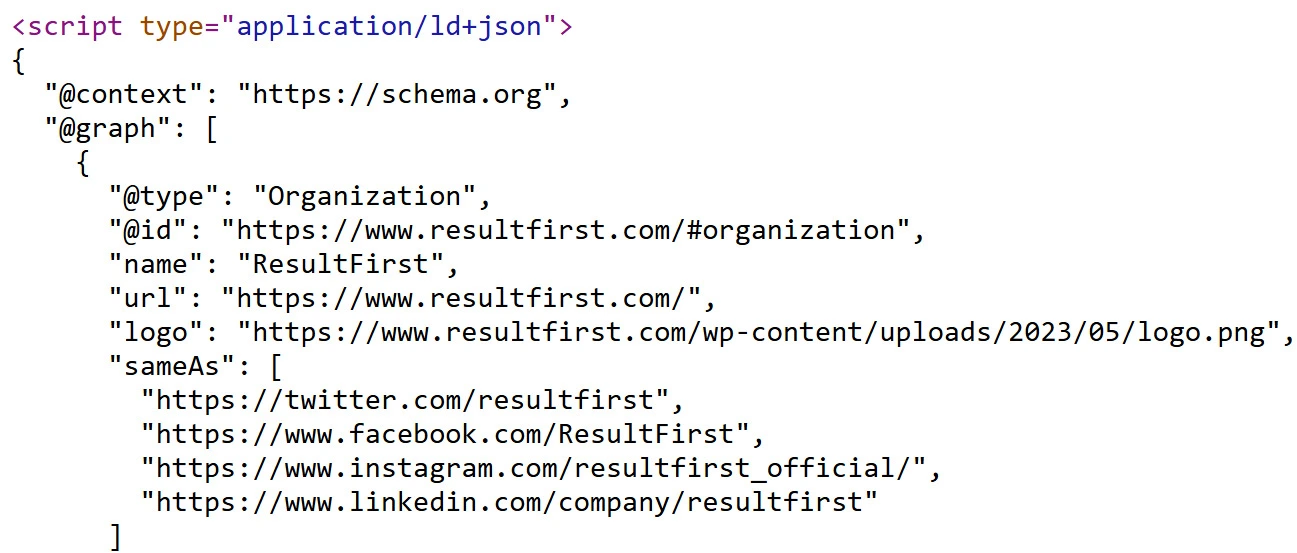
Structured data in Schema.org JSON-LD format tells Google and AI systems what type of content a page contains, who authored it, when it was published, and what entities it discusses. It is a primary factor in determining whether a page appears in rich results, AI Overviews, and LLM citation responses.
Structured data must be present in the mobile version of the page. Recommended schema for blog content:
- Article schema with author.name, datePublished, dateModified, and publisher.name populated
- FAQPage schema for FAQ sections — actively used by Google’s AI Overview selection process and by Bing Copilot, Perplexity, and ChatGPT
- BreadcrumbList schema — keep as is
For ecommerce product pages, include Product schema with price, availability, and review aggregation data. See our ecommerce structured data guide for full implementation details.
Related: 7 Important Ecommerce Schema Markups
14. Optimize Header Images
Hero and header images are the most common cause of poor LCP scores on mobile. A desktop-sized hero image at 1,200px wide and 400KB served to a mobile device that needs only a 390px wide version wastes bandwidth, increases load time, and directly degrades LCP.
- Serve WebP format. WebP files are 24-35% smaller than JPEG or PNG at equivalent visual quality.
- Use srcset for responsive image delivery. The srcset attribute lets the browser select the right image size for the current viewport.
- Define width and height on every image element. This prevents CLS by reserving the correct layout space before the image loads.
- Preload the LCP image. Add a link rel=”preload” as=”image” tag in the document head pointing to your hero image.
15. Fixing Faulty Redirects and Cross-links
Redirects mean referring a user to another page. Redirects are usually used when you have separate URL configurations.
It would be best if you redirected the desktop URL to the appropriate mobile URL. However, avoid faulty redirects, such as redirecting a desktop user to any irrelevant page on a mobile site. Here is an image for a more in-depth illustration.

Source: Developers.Google
The same case is with crosslinks. Crosslinks refer to links between two sites. Here is what happens: you link your site page to the relevant page on another website. So it’s important to link to relevant pages. It is not appropriate to link from the desktop page point to the homepage of mobile websites.
16. Control 404-page Errors
Sometimes you visit a page from the desktop device, and it serves you normally. However, when you visit the same page from a mobile device or any other, it shows 404 errors.

It usually appears when your visitor gets the same desktop URL on the mobile device. So when you have different mobile sites and desktop sites, then it is good to redirect the user to relevant mobile URLs.

And along with that, Google recommends you check that the mobile page is not an error page.
17. Optimize for Local Searches
Mobile and local SEO are closely aligned disciplines for US businesses. Approximately 82% of local searches happen on mobile. 76% result in a business visit within 24 hours. “Near me” search volume has grown by more than 500% over two years. See our local SEO guide for the complete local strategy.
For mobile local SEO:
- Place your phone number as a click-to-call link using the tel: href format in the above-fold area of your homepage and contact page
- Ensure NAP (Name, Address, Phone) is consistent across your website, Google Business Profile, and all directory listings
- Use LocalBusiness schema with address, phone, business hours, and geo coordinates populated
- Embed a Google Maps link on your location page to allow users to get directions without leaving your site
Click here: How To Make The Most Out Of Local SEO
18. Mobile Conversion Optimization
Mobile SEO that drives traffic but not revenue is incomplete. The conversion path on mobile has different friction points from desktop.
Call-to-action placement: Place primary CTAs in the above-fold area on mobile. The button should be at least 44px in height, high-contrast against the background, and labeled with a specific action. “Get My Free Audit” converts better than “Contact Us.”
One-tap payment: For ecommerce checkouts, Apple Pay and Google Pay integrations remove the largest mobile conversion barrier, manual credit card entry.
Form design: Reduce required fields to the minimum necessary. Use HTML5 input types to trigger the appropriate mobile keyboard. Add autocomplete attributes to activate browser autofill.
Chat widget placement: Position live chat or support widgets so they do not cover the primary CTA button.
19. Canonical Tags and URL Consolidation
Canonical tags help search engines understand which version of a page should be treated as the primary one. This is essential for preventing duplicate content issues, especially on mobile devices where URLs may differ due to filters, parameters, or tracking tags.
In modern mobile SEO, canonical tags are commonly used to:
-
Consolidate URLs created by product filters or sorting options
-
Handle pagination and category variations
-
Prevent duplicate indexing caused by tracking parameters
-
Maintain consistency between similar content pages
When using responsive design, the same URL typically serves both desktop and mobile users. In this case, canonical tags reinforce URL authority rather than manage device-based versions.
Proper canonical implementation helps preserve ranking signals and ensures search engines index the correct page version.
20. Meta name= viewport tag
When you’re using responsive web design, a viewport tag comes into play. It tells the browser about scaling and adjusting the page according to the length and width of the user’s device.
This means the browser will show the desktop-optimized page at desktop screen width while mobile-optimized at mobile screen dimensions. But if you don’t use it, browsers may adjust the page at desktop dimensions on the mobile device which will surely harm your rankings.
Google recommends that you use the viewport tag with the following content.

21. Voice Search Optimization
Voice search accounts for approximately 27% of all searches globally. The majority of voice queries occur on mobile. Voice queries have fundamentally different syntax from typed queries: they are longer, phrased as full questions, and conversational in tone.
To qualify for voice search results and AI Overview citation:
- Structure FAQ sections with question-phrased headings at H3 or H4 level followed immediately by a direct 40-60 word answer paragraph
- Write answer paragraphs in active voice and present tense — passive constructions and nested clauses do not read naturally when spoken aloud
- Use the People Also Ask box in Google’s SERP as your voice keyword source — these are the exact questions users speak to Google Assistant
- For local voice search: include the business city, region, and geographic language in your page content
Mobile SEO and AI Overviews: The 2026 Ranking Layer
Google’s AI Overviews now appear at the top of the mobile SERP for the majority of informational and how-to queries in the United States. On a phone screen, the AI Overview occupies the entire above-fold area, pushing all organic results below the fold.
How AI Overviews select cited content:
- Cited pages answer the query directly in a self-contained passage positioned near the top of the page. AI systems prioritize passages that begin with the answer rather than building toward it.
- The specific words in your heading and topic sentences must match the language of the query you are targeting.
- Complete structured data signals document authority Article schema with populated author, datePublished, dateModified, and publisher fields; FAQPage schema marks Q&A content as explicitly structured for question-matching.
Verify AI crawler access in your robots.txt. Third-party LLM platforms use their own crawlers:
- GPTBot (OpenAI/ChatGPT)
- ClaudeBot (Anthropic/Claude)
- PerplexityBot (Perplexity)
- CCBot (Common Crawl)
- Bingbot (Bing Copilot)
If your robots.txt blocks any of these user agents, your pages cannot be cited in those platforms. Check your robots.txt and remove any Disallow rules for AI crawlers. For a full comparison of tools to help manage this, see our guide here.
Mobile SEO Audit: Where to Start and What to Check
A mobile SEO audit has six priority areas. Work through them in order. Issues flagged by Google’s own tools take priority over third-party findings.
Step 1: Google Search Console — Mobile Usability Report. Navigate to Experience, then Mobile Usability. The most common errors are: clickable elements too close together, text too small to read, viewport not set, and content wider than screen. Fix every flagged URL before addressing anything else.
Step 2: Core Web Vitals Field Data. Open Core Web Vitals under Experience in Search Console. Target Good status for all three metrics: LCP under 2.5 seconds, INP under 200ms, CLS under 0.1.
Step 3: Content Parity Verification. Use URL Inspection on your highest-priority pages. Click “Test Live URL” and confirm all body text, headings, structured data, and internal links are present in the rendered mobile HTML.
Step 4: Image Audit. For every image on high-priority pages, check: Is it served in WebP format? Does it have explicit width and height attributes? Is it sized appropriately for the mobile viewport?
Step 5: JavaScript Audit. Run PageSpeed Insights and review Opportunities for “Eliminate render-blocking resources” and “Reduce JavaScript execution time.” Defer third-party scripts including analytics tags, chat widgets, and remarketing pixels until after first user interaction.
Step 6: AI Crawler Access Check. Visit yoursite.com/robots.txt and confirm GPTBot, ClaudeBot, PerplexityBot, Bingbot, and CCBot have no Disallow rules.
Tools and Tests for Mobile SEO
Google Search Console — Provides page-level Mobile Usability error reports, field-measured Core Web Vitals data, URL Inspection for rendered HTML verification, and keyword performance segmented by device. Free.
Google PageSpeed Insights: Runs both lab diagnostics and field data analysis for any URL. Shows Core Web Vitals field data alongside Lighthouse scores with specific recommendations.
Chrome DevTools Device Emulation: Available in any Chrome browser. Press F12, then open the Device Toolbar with Ctrl+Shift+M (Windows) or Cmd+Shift+M (Mac) to test pages at real mobile viewport sizes.
Google Rich Results Test: Verifies that structured data including Article, FAQPage, BreadcrumbList, and Product schema is correctly implemented. Free at search.google.com/test/rich-results.
XML Sitemap: Ensure your sitemap is submitted in Search Console and references only canonical URLs. Pages with noindex tags, blocked by robots.txt, or behind redirects should not appear in the sitemap.
Conclusion
Mobile SEO is not a one-time setup. Google updates its mobile crawl criteria, Core Web Vitals thresholds, and AI Overview citation logic continuously. The March 2026 Core Update raised the quality bar for guide-level and strategy-level content.
The sites holding top-3 positions for competitive mobile SEO keywords treat this as an ongoing performance audit program: quarterly reviews of Core Web Vitals field data, content updates that reflect current Google guidance, structured data maintenance as schema specifications evolve, and regular checks of AI crawler access as new LLM platforms launch.
ResultFirst works with US ecommerce brands and SaaS companies on performance-based SEO programs. Fees are tied to ranking and traffic outcomes, not a fixed monthly retainer. If you need a mobile SEO audit that maps to revenue impact rather than a scorecard of abstract metrics, contact the ResultFirst team.
WHAT TO READ NEXT
READY TO BUILD PREDICTABLE ORGANIC GROWTH?
We are the only TOP SEO services agency providing Real Results in a Real Performance model. We help growth hungry companies outperform their competition and achieve 300%+ growth in their digital marketing initiatives.
- San Jose, CA, 95120

- +1-888-512-1890

- sales@resultfirst.com

300K+
KEYWORDS RANKED
546M+
REVENUE GENERATED
18 Years
SOLVING COMPLEX SEO
150+
TEAM MEMBERS