
The comment section of a blog is a standard feature; however, very few people pay attention to it. Our enterprise SEO solutions can help improve user engagement. Though, a few blog designers have created comment sections designs that make their blogs look exceptional and provide additional functionality.
In this article, we will focus on the 15 best comment section design trends, identified by top SEO services, that web designers can use to make their blog look unconventional.
Best Comment Section Designs for Websites
Flat View
While scanning the latest design trends emerging for 2026, you may notice a refreshing shift towards a more minimal, back-to-basics aesthetic. Comment sections that have grown cluttered and chaotic in recent years are primed for a simplifying update.
A flat view prioritizes easy reading and quick scanning above all else. All non-essential frills and embellishments are stripped away so users can zip through posts and replies with minimal friction.
Focusing the flat view mainly on plain text helps comment sections feel breezy and lightweight for readers. You may opt for a basic font and font size without much styling so nothing distracts from the words.
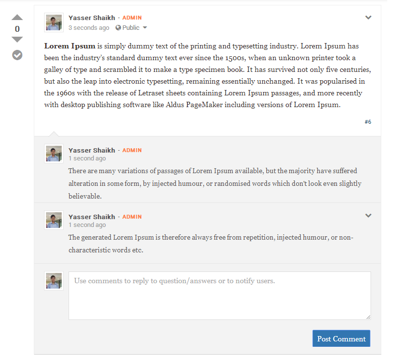
Keeping the color palette light and bright maintains an airy feel as well. Spacing between comments expands for increased breathing room.
Threaded View
Users desire better ways to engage with live discussions. A threaded view aims to satisfy this need by visually connecting related replies.
You can employ indents, lines, or other graphical cues to clearly show how each response is nested under the original comment.
This makes long, branching conversations easier for readers to follow intuitively without losing their place.
When designing with threading in mind, emphasize clarity over all else.
Simple yet distinct formatting helps users immediately recognize parent-child relationships without skimming through replies. Proper spacing and alignment reinforce the logical flow.
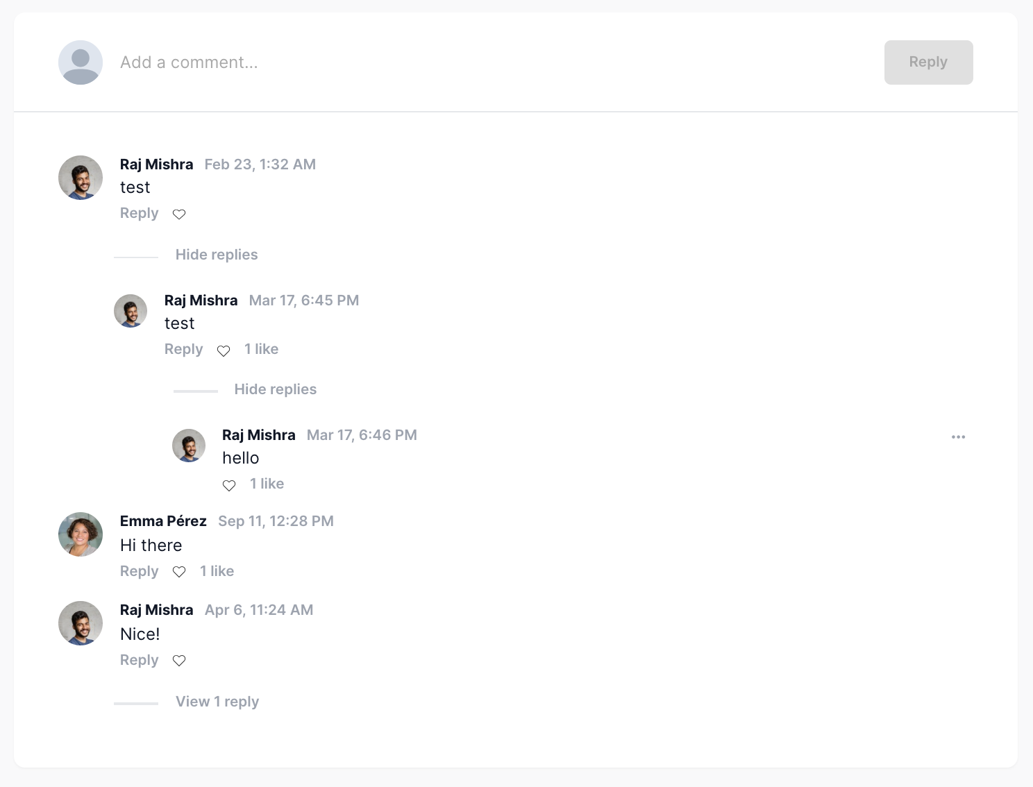
You may also allow nested comments to stretch the full width, so nothing feels cut off or truncated. With a threaded view, facilitating participation in lively debates smoothly becomes your objective. Subtle threading helps keep conversations accessible and enjoyable for all.
Mobile Threaded View
As commenting continues to shift to mobile, you’ll want designs optimized for smaller devices. Users expect engaging conversations wherever they go, so your threaded view must translate thoughtfully. You may use touch gestures to represent indentation levels intuitively.
Vertical swiping could replace clicking threads to expand and collapse replies. Dynamic formatting adapts to various screen sizes while maintaining clarity.

Visual hierarchy becomes even more important with limited real estate, so emphasize parent-child relationships clearly. Proper spacing and size adjustments help users parse threads seamlessly when scrolling.
Preview Selected Comments
A preview feature lets visitors scan selected comments without scrolling through entire conversations.
You may implement a lightweight modal displaying truncated versions of top-ranked or most replied-to comments when they click a thread.
This gives users a quick sense of the discussion’s tone and content at a glance.
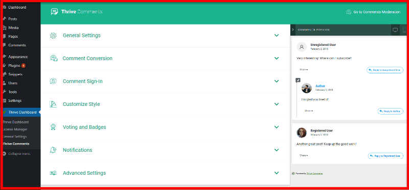
Dynamic previews update as they select different comments, helping readers get a full picture before committing time to reading. You can also consider previewing comments attached to notifications to help users decide if they’re worth diving into.
Collapse Lower-Level Comments
You want to help users parse conversations efficiently. Allowing lower-level replies to collapse preserves the flow while reducing clutter.
Readers can expand subthreads as interest dictates.
You should implement subtle cues like shortened lines or indented blocks that disappear to visualize hierarchy succinctly.

Dynamic collapsing adapts to user engagement, focusing on what currently matters most. Scannability remains paramount, even in complex discussions.
Establish a Solid Visual Hierarchy
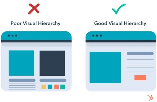
Understand the importance of clear signals. Establishing a solid visual hierarchy orients users as they browse threads.
Proper formatting, sizing, and spacing clues reinforce the logical flow of each response relationship.
You may use factors like indentation, borders, backgrounds—anything to instantly communicate how replies are nested.
Readability must prevail so all cues are discernible without distraction. An intuitive structure streamlines the user experience.
Show Only the Most Needed Actions
Keeping the commenting interface clean and streamlined means focusing only on the core interactions that people come for—to express themselves, connect with others, and continue the conversation.
Things like replying directly to a comment, expressing support or disagreement through clear and simple reactions, or sharing meaningful content with other communities are intuitive actions that don’t require much explanation.
Cluttering the space with unnecessary frills or promotional prompts will only serve as a distraction. People want to immerse themselves in discussion, not wade through irrelevant asides.
Give them wide-open spaces to have their say without a bunch of buttons and banners getting in the way. Subtle calls-to-action within the natural flow of commenting are fine, but don’t hijack the experience.
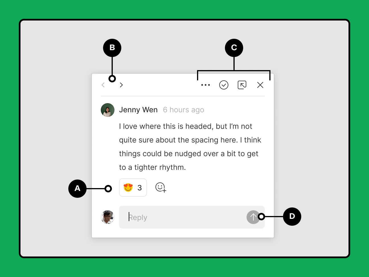
Truncate Longer Comments
Long-winded comments demanding scrolls disrupt conversational flow. You can implement judicious truncating, whether based on character counts or formatting breaks. It balances substance with aiding quick scans through threads.
Expanding truncated sections on click reveals full context without losing place. You may also truncate replies to optimise parent-child relationships. Dynamic solutions keep discussions fluid while respecting readers’ time and focus.

Allow Users to Share Comments
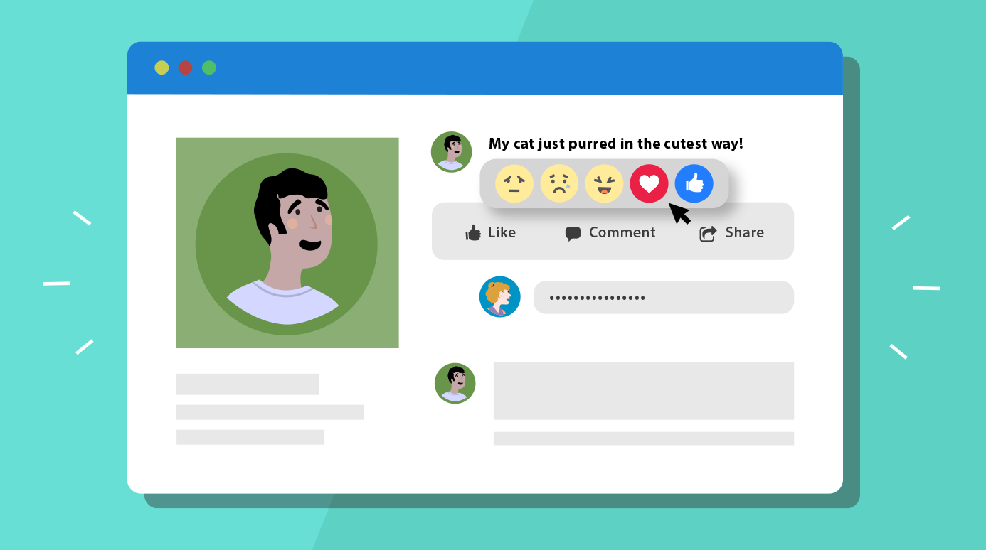
When designing for a community, you recognise the power of social features.
Allowing users to easily share select comments benefits discussions by spreading intriguing perspectives.
You can implement shareable quotes or embedded previews that don’t disrupt context. Links auto-update when comments change.
Testing ensures sharing feels natural rather than forced. It encourages contribution by giving social incentives and finding new audiences.
Make First-Level Comments the Main Focus
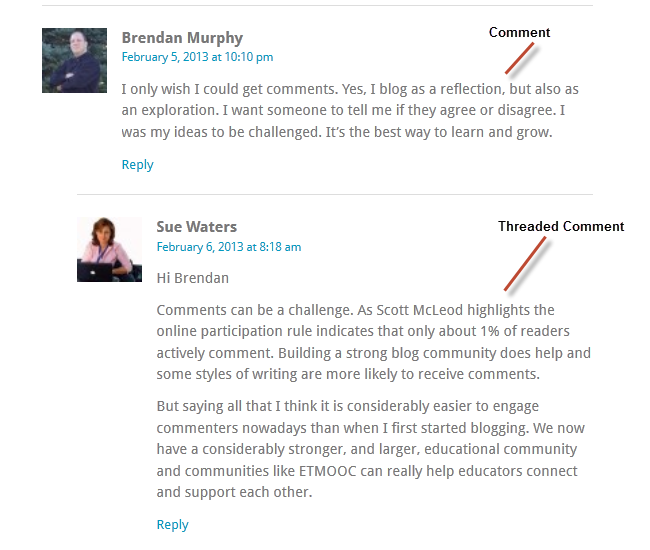
First-level posts set the stage for entire conversations by introducing core topics, viewpoints or questions.
- As a designer prioritizing usability, you ensure first comments receive subtle emphasis to help users grasp discussion context swiftly. Proper formatting, sizing or placement cues can feature initial perspectives more prominently without distraction.
- Responsive designs adapt this emphasis to various platforms. On mobile, first comments may float atop threads for effortless scanning. Elsewhere, soft typographic treatments like increased font size or weight help initial posts stand out without cluttering threads.
- Negative space and intentional line breaks also reinforce first comments’ importance as logical anchors.
- Interactivity strengthens the first post’s focal role. Clicking their titles could automatically expand subsequent replies beneath, like a makeshift table of contents. This gives mobile users instant thread overviews. Hover effects may preview the first comments before expansion as well.
- Prioritizing first comments’ understandability ultimately streamlines participation. Users enter discussions informed rather than confused, primed to consider varying perspectives thoughtfully. From there, intuitive flows lead readers through logical reply trees down to granular details.
- With first posts as foundations, conversations flourish easily for all.
Allow Mentions
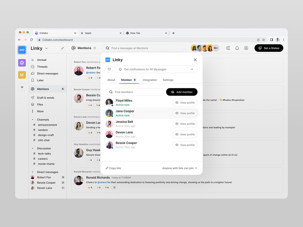
When crafting a commenting system, you aim to foster engagement.
Allowing users to mention each other within discussions facilitates productive interactions.
You can implement auto-linking mentions to corresponding user profiles.
Notifications then keep conversations flowing by alerting the mentioned. Accessible functionality maintains usability—perhaps even predictive menus.
Testing ensures it feels seamless rather than disruptive. Mentions strengthen communities through collaborative and thoughtful exchange.
Also Read: What are the Responsibilities of Web Designers
Few Examples to Get Inspired
- WordPress
- Digg
- Webdesignerwall
- Chi Garden
- Hicks Design
- Pro Blog Design
- QN5 Blog
- Design Work Plan
- UX Booth
- Mr. Henry
- JustBcoz
- StyleSpion
- Tutorial9
- ANidea
WordPress Blog

The comment section on WordPress blog is appealing as well as simple. It won’t be wrong to say that WordPress blog designers believe that simplicity is the best way to ‘engage’ customers.
Digg
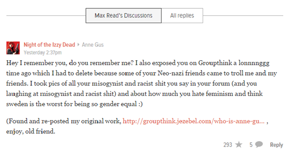
Now, I won’t call it the best design for a comment section, however, Digg definitely understands what customers need from a comment section. The star button in the comment section that allows the users to recommend is interesting.

Reddit comment section allows the users to check the ‘best comments.’ You can also check permalink that allows you to view a comment thread, separating what you are not interested in from the clutter.
Webdesignerwall.com

Now that’s what we call an appealing comment section design. The design is simple but color and font makes it look appealing. Also, the lines make it appear clean and reduce the clutter.
Chi Garden

Love beauty? Chi Garden is the website you must visit. A comment form that is appealing to eye, simple, easy to use and definitely impressive, Chi Garden also allows the users to have an avatar.
Hicks Design

The colors of this blog make it look appealing. Also, the font size used is different from common ‘Times New Roman,’ which makes it appear better.
Pro Blog Design

The green used on this website make it look different from common white blogs with black fonts. The color combination attracts the attention of the viewers.
QN5 Blog

If we talk elegance, this is the blog to look at. QN5 blog has simple design but its colors make it appear impressive.
Design Work Plan

The website does not use a lot of different color combinations. However, green and white works well with the overall design of the blog, which makes this comment section design worth mentioning.
UX Booth

Another design that shouts that simplicity is the way to go. This is another blog that is known for its simple design and impressive fonts. If you are a fan of mature design and fonts, you are sure to like this design.
Mr. Henry

Won’t really call it a user-friendly design but if you like black, grey and dark combinations, this may appeal to you.
JustBcoz

The designer of this website definitely loves to play with soft colors and we must say that he is doing a great job. The color combinations are appealing and soothing at the same time.
StyleSpion

This is another design that experiments with fonts. They have kept it simple but the fonts in black color make the comment section appear pleasant and neat.
Tutorial9

Nothing different about this design but if you have a simple blog in white background, this one can go with the theme.
ANidea

The combination of black, white and pink made us mention this one. The design goes well with the theme and looks impressive.
Contact us online to learn more about Comment Designs Trends for Web Designers.
Also Read:
6 Essential Web Design Elements That Help Businesses Attract Customers to Their Website
Know about Top Innovative Comment Section Design Trends:
In this video we will discuss a feature that’s often overlooked but can make or break user engagement, that is the comment section.
—watch now!
WHAT TO READ NEXT
READY TO BUILD PREDICTABLE ORGANIC GROWTH?
We are the only TOP SEO services agency providing Real Results in a Real Performance model. We help growth hungry companies outperform their competition and achieve 300%+ growth in their digital marketing initiatives.
- San Jose, CA, 95120
- +1-888-512-1890
- sales@resultfirst.com


 sales@resultfirst.com


