



 sales@resultfirst.com
 +1-888-512-1890
How to Optimize a Shopify Store for Mobile in 2026: 7 Proven Tips

Global retail e-commerce sales are forecast to reach $6.88 trillion in 2026, a 7.2% increase from the previous year. Meanwhile, mobile traffic accounts for 78% of e-commerce traffic.
Mobile commerce makes up most of the traffic for online purchases. So, if your Shopify website is not mobile-friendly, you are already losing sales to your competitors every day.
But being responsive is not enough now. The brands that will succeed in 2026 will not just be “responsive” but smart. Now, with AI integration, everything from mobile checkout to visual search for products will take place. Optimize your Shopify store for mobile shopping, which will eventually be AI-powered.
Keep reading to learn how to optimize a Shopify store for mobile, with practical steps for technical SEO, UX, Core Web Vitals, product pages, navigation, checkout, and AI-driven search visibility.
Why Does Mobile Optimization Matter for Shopify Stores?
Source: GenovaWebArt
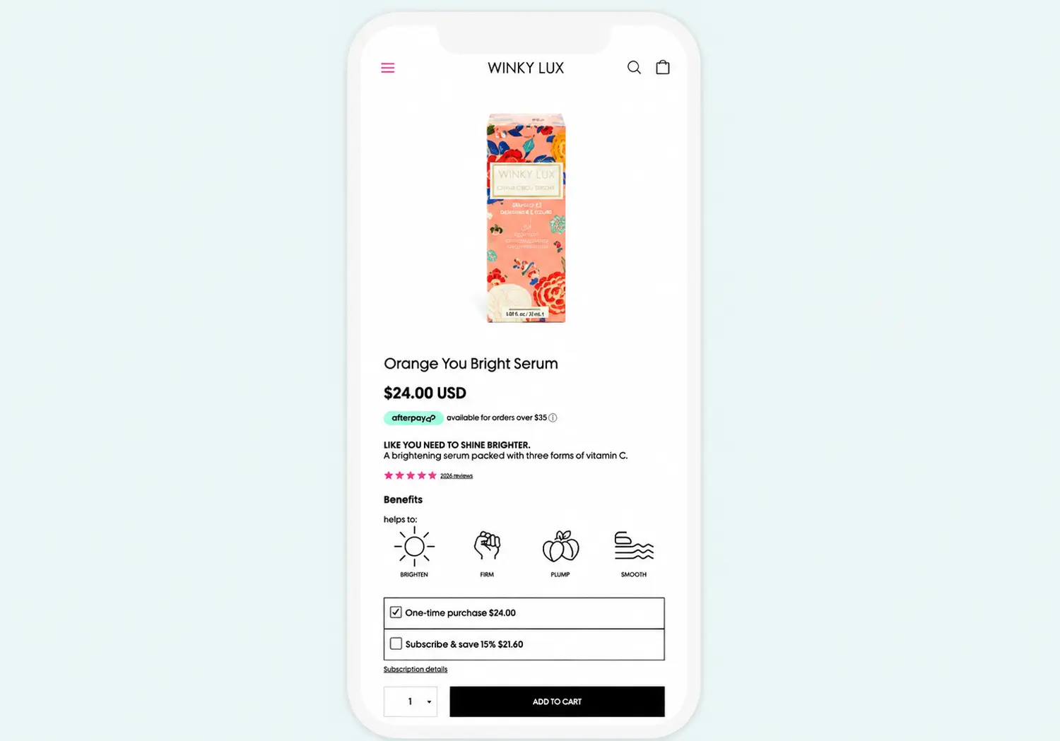
When you create a mobile-friendly Shopify store, your site does not simply adapt to work on a small screen. From the moment the consumer begins the process until their purchase is made, friction is reduced. They can access your product through Google, social media, AI response, or sharing.
Higher Conversion Rates and Lower Bounce Rates
Most customers today use mobile devices, and this is directly linked to the mobile conversion rates. Every additional one second of delay in loading time could negatively affect mobile conversion rates by up to 20%.
However, Deloitte’s research shows that for every additional 0.1 seconds that the page takes to load, there is an increase in the retail conversion rate by 8.4 percent. Users would simply not buy anything on your website if it takes too much time to load your pages
Mobile usability is a key ranking and conversion factor because, as of early 2026, 79% of Shopify traffic comes from mobile devices.
Improved SEO Performance
Google is adopting the mobile-first indexation and ranking system. In essence, your website is indexed and ranked by Google depending on the mobile version of the website. Your website may be having a great design when it comes to the desktop version, but if the mobile version is not user-friendly, then you will have low rankings on Google.
Frictionless Customer Experience
Mobile shoppers often have shorter, more distracted sessions. They require rapid access to product information and swift transaction processes. By implementing mobile optimization, having a sticky navigation bar, clear CTAs, and a one-page checkout, you will make the process more straightforward and minimize cart abandonment.
How Google and AI Platforms Evaluate Your Mobile Store

Since Google has adopted its mobile-first indexing feature, the search engine primarily relies on the mobile version of your website’s content.
Buyers can now be introduced to the product offerings via Google AI Overviews, AI Mode, ChatGPT Search, Perplexity, Gemini, and many more answer engines. They have the capability to comprehend entities, products, and intent using data from the search index, structure, webpages, and much more.
That creates a broader optimization goal.
Your Shopify store should not only be easy for a human to browse. Its content should also be easy for search systems and AI platforms to interpret.
That translates to the same core principles that enable Google’s mobile-first index to recognize your store as well as enable AI to find and cite your store:
- Structured product data (product, breadcrumb, and organization schema) allows both Google and AI systems to have clear and unambiguous signals for entities on a scale of the whole catalog.
- PDP layout consistency: the same ordering, labeling, and layout of fields for all the products ensure that the template will be correctly parsed.
- Fast and reliable mobile rendering becomes important because Google’s mobile-first indexing system prioritizes mobile versions: if your page has poor Core Web Vitals, that is the version of the page that is being considered for ranking and AI processing.
10 Tips to Optimize Your Shopify Store for Mobile
Before you start redesigning anything, pause and audit what’s already happening on mobile. Most stores have a visibility problem. You need clear eCommerce customer data on how they behave, where friction shows up, and which pages silently kill conversions. AI can help analyze this customer data faster, uncover hidden behavior patterns, and highlight the mobile issues most likely to affect conversions.
A strong audit gives you a baseline. It tells you what to fix first, what to ignore, and where small tweaks can drive the biggest revenue impact.
1. Use a Responsive, Mobile-First Theme

Source: HaloThemes
Responsive web design is the foundation of mobile-friendly design. It means your layout automatically adapts to different screen sizes and resolutions using one unified theme. As Shopify SEO strategist Greg Bernhardt explains, “That’s number one. You have to have that. That’s like the big rock. If you don’t have that, nothing else really matters.”
How to select the mobile-friendly Shopify themes
It should be remembered that not all themes are equally responsive on a mobile device. You should check a particular theme using your mobile device rather than a computer version. There are several things that you should keep in mind: Is the theme loading fast? Is there a clearly visible navigation menu? Do the images load?
The themes of Shopify have been created in such a manner that they work well for mobile devices and are quick too. For example, Shopify’s Dawn theme is one of the most efficient ones regarding its performance.
Moreover, there is an option of editing your theme separately for mobile and desktop in Shopify. You can make use of this feature to hide desktop-only features from the mobile device view.
2. Improve Mobile Page Speed
Source: Website Speedy
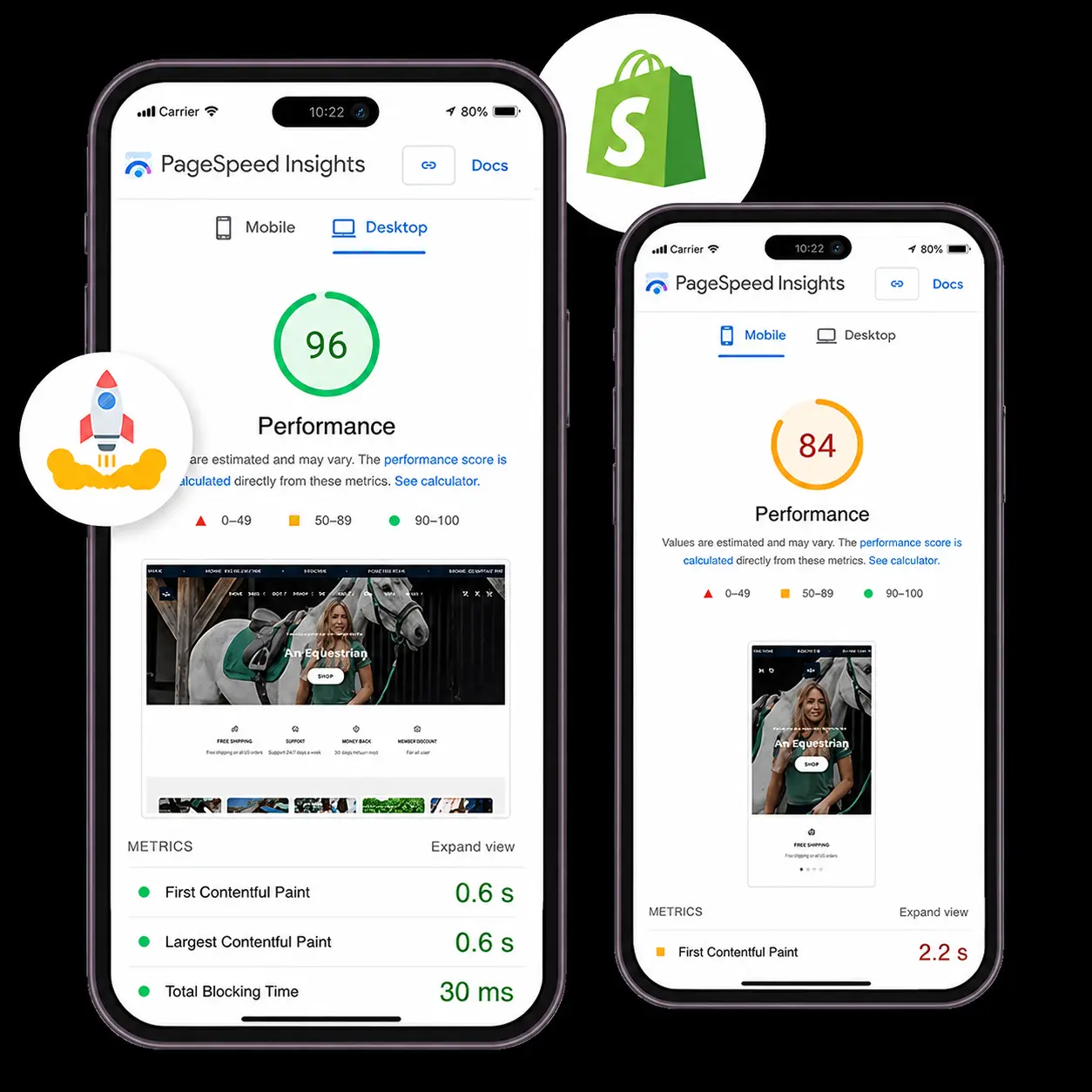
Page speed plays a critical role in SEO and conversion optimization within e-commerce websites (documentation from Google PageSpeed Insights). A single-second page loading delay can affect mobile conversions negatively by 20%..
An average of 15 to 20 apps is now being used in the average Shopify store, and each of them adds 100 to 500 milliseconds of JavaScript on every page load, bringing the mobile PageSpeed performance from 70 down to the 20s.
What to do: The ideal score to attain on your mobile device should be above 60. Ensure that your Largest Contentful Paint (LCP) is below 2.5 seconds. This can be done using the Google PageSpeed Insights tool
- Auditing and removing unused apps. App bloat is the single biggest speed killer on Shopify. Remove apps that aren’t actively earning their keep and disable leftover app embeds.
- Compressing images. Use tools like TinyPNG or Shopify-native optimizers.
- Minifying CSS and JavaScript. Remove unnecessary whitespace, comments, and dead code.
- Implementing lazy loading. Ensure images below the fold use loading=”lazy” to defer off-screen content.
Headless Shopify Implementation Considerations
At what point does it make sense to go for a headless Shopify store architecture?
The headless model separates the Shopify back-end from its front end. This allows you to develop your front end using a framework such as Next.js for best performance results. The headless architecture is ideal for stores that have lots of traffic and development resources. It involves a lot of investment on the tech side.
3. Optimize Images for Mobile
Images make up the biggest file sizes on any Shopify store. The main reason why sites have problems with mobile loading speed is that they are not optimized properly.
What to do:
- Resize images for mobile screen dimensions and compress them without sacrificing quality.
- WebP is an alternative format for smaller images.
- Alt tags should be given to each of the images.
- In hero sections, a hero image should be used rather than a slideshow.
- Define the image dimensions (the height and width of the images) in the backend to avoid layout shift (CLS).
The banners should have different sizes depending on whether they will be seen on desktop or mobile devices. A 1440 x 500 pixel banner, which appears perfect on a desktop computer, will look distorted when viewed on a mobile phone. The best height for a banner when viewed on a mobile screen is less than 300 to 400 pixels.
4. Simplify Navigation with a Fixed (Sticky) Bar
The mobile navigation should require just a couple of taps for accessing any particular product or category. Apply a hamburger navigation or bottom navigation, which involves no more than five to seven main categories.
Never apply a drop-down navigation that contains several levels of subcategories. In case of having too many categories, consider adding an active search bar.
For example:
Shop >> Women >> Shoes >> Running Shoes
is easier to understand than the menu with lots of irrelevant links.
5. Design for Mobile UX and Interface Experience
Mobile users are different from desktop users in behavior; they scroll, click, and remain on the website for only two minutes compared to five minutes for desktop users.
Tips on how to increase mobile UX for your site:
- Add a hamburger menu or a slide-out navigation bar
- Make lengthy pages into small chunks
- Make sure that your website has buttons which are large and clickable (should be at least 48×48 pixels)
- Get rid of unnecessary scrolling
Create Clear Calls-to-Action (CTAs)

A CTA button is the conversion tool that makes visitors your customers. CTA buttons need to be extremely simple to use on mobile devices.
Steps to follow:
- The CTA must stand out from all other elements through contrasting colors.
- They need to be made big in size (48×48 pixels) and located in the thumb zone (central to the lower part of the screen).
- Use action-based text (such as “Buy now,” “Add to cart,” etc.).
- Experiment with placement and text to find out what works best for maximum conversions
Add a Sticky “Add to Cart” Button
The idea behind the sticky “Add to Cart” button is that it stays at the bottom of the page even when a customer is scrolling down the product description. Thus, it eliminates the need for a customer to scroll back up to the top of a long page
How to implement it: Implement the “Quick Buy” or “Sticky Add to Cart” option in the settings of your theme or via Shopify plugins. The button must be 48 pixels high so that you can click on it using your thumb. You can make this feature on your own by editing the theme code. But the use of plugins is easier
6. Fix Layout Shifts (CLS)
Layout Shift Score (CLS) is the measure of how stable your page is. Whenever there is an element like an image or ads loaded that changes the layout of your content, the CLS happens and makes you press the wrong buttons. CLS should always be below 0.1 for your website (Google Core Web Vitals).
What to do:
- Specify image and video dimensions (height and width attributes) to ensure the browser reserves the correct space.
- Make sure there is a designated area for the advertisement to prevent content from being pushed away.
- Make sure you optimize your custom fonts to prevent the FOIT and FOUT effects that could lead to layout shifts. Make use of Shopify’s Typography 2.0 setting if possible.
- Make use of placeholders for your dynamic content.
7. Streamline the Checkout Process
Source: Agente
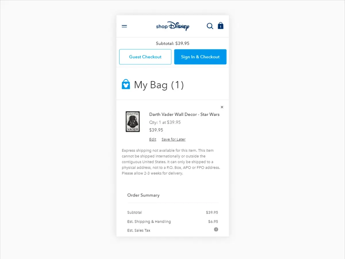
The reason for cart abandonment is the complex checkout experience. As per Baymard Institute, close to 70% of the carts placed on websites are abandoned due to issues related to friction. The checkout process for mobile shoppers needs to be quick and easy.
What to do:
- Enable guest checkout. Being required to have an account created is a big deterrent from making a sale.
- Have as few form inputs as possible and only ask for relevant data to ensure privacy and efficiency.
- Have address and credit card inputs autocompleted.
- Provide mobile payment solutions such as Shop Pay, Apple Pay, and Google Pay for easy checkouts.
- Have a visual cue indicating how many steps are left.
How Do AI Search Platforms Evaluate Shopify Stores?
AI-powered search engines, such as Google AI Overviews, ChatGPT Search, Perplexity, and Gemini, do not spider your Shopify website on their own. It is important to know how they find and rank online retail information.
The retrieval mechanism:
AI systems make use of existing indexes and structured data, while third-party verified sources are used instead of independent web crawlers. AI systems access content from indexed sources (Google search index for AI Overviews) and live search sources that access Bing’s index or other search APIs (Perplexity, ChatGPT Search Mode).
What makes a Shopify store AI-discoverable:
- Structured product data: Complete Product, Offer, and AggregateRating schemas with accurate pricing, availability, and variants allow AI to understand product characteristics.
- Entity signals defined: Proper PDP structure, Organization for brands, and relations between products and their categories increase the chance of being featured in AI-created abstracts.
- Content that answers questions first: Product pages and collection pages that directly answer common customer questions (either in product descriptions, FAQs, or comparison information) will more often become answers in AI Overviews and conversational searches.
- AI crawler settings and llms.txt: As of 2026, there are such things as AI crawler settings and llms.txt that control AI access to your site’s content, even if most Shopify sites haven’t adopted these yet.
Doing well in relation to these surfaces is all about succeeding in doing traditional SEO well (indexation, schema, and authority content) as opposed to having AI tools access your website as a user.
What Kind of Content Increases AI Citation for Mobile Optimization?
Source: Mavler
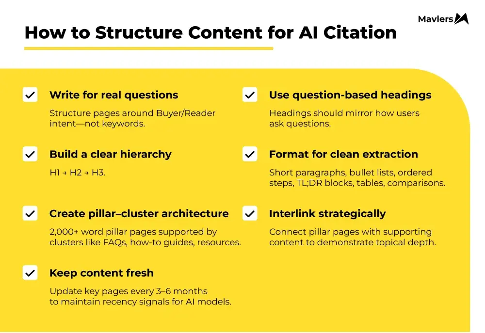
For your content to be cited by AI, it needs to be authoritative and extractable. Here is what moves the needle for mobile optimization content:
- Original Case Studies and Audit Findings: ResultFirst’s internal audit data shows that stores with a mobile PageSpeed score below 50 experience an average 30% higher bounce rate than stores scoring above 70. This type of proprietary, first-hand data is highly citable by AI systems.
- Before/After PDP or CLP Examples with Concrete Metrics: AI systems are given verifiable, specific examples by displaying a particular store that saw a 15% increase in mobile conversions and improved its mobile LCP from 4.5 seconds to 2.1 seconds.
- Comparison Tables: AI systems can easily parse and extract the structured data found in comparison tables, such as the “Common Mistakes to Avoid” section below.
- Proprietary Frameworks: Frameworks like the 10-step guide above, when presented as a logical, sequential process, are more likely to be cited than generic advice.
- Expert Insight and Authoritative Quotes: First-hand expert insights, as the one included earlier, provide a unique, human perspective that AI systems often prioritize over general, aggregate statements.
How to Test Your Mobile Performance
Optimization is an ongoing process. Regular testing ensures your store stays competitive.
Testing Tools:
- Google PageSpeed Insights: The primary tool for Core Web Vitals and mobile performance scores (Google PageSpeed Insights, 2025).
- Shopify Performance Dashboard: Found in your admin, provides a store-wide trend.
- Google Lighthouse (Chrome DevTools): Offers detailed render traces and identifies unused JavaScript.
- Real Device Testing: Open your store on different smartphones, browsers, and screen sizes. Test the entire user journey from landing to checkout.
What to Test:
- Page loading speed
- Navigation flow
- Checkout process
- Product page performance
- CLS and other visual stability metrics
Final Thoughts
Handheld devices have changed what customers expect from online shopping. A well-optimized Shopify store for mobile is no longer a differentiator. It’s the baseline for staying competitive.
By prioritizing responsive design, page speed, thumb-friendly UX, and SEO best practices like mobile-first indexing, you can create a seamless experience that drives revenue. The statistics are clear: a faster, easier mobile experience means higher conversions, better SEO, and more sales.
ResultFirst’s performance-driven ecommerce SEO services help brands optimize mobile UX, Core Web Vitals, product pages, and AI search visibility to attract high-intent shoppers and turn mobile traffic into conversions.
Curious how your current mobile strategy scores against these best practices? A Shopify mobile SEO audit can show you exactly where the gaps are. Contact ResultFirst to learn how we can help you optimize for both traditional search and AI-driven discovery surfaces.
Sources Referenced:
- https://www.statista.com/statistics/568684/e-commerce-website-visit-and-orders-by-device/
- https://www.shopify.com/blog/mobile-first-indexing/
- https://baymard.com/research/checkout-usability/
- https://support.google.com/google-ads/answer/7543502?hl=en
- https://www.thinkwithgoogle.com/_qs/documents/9757/Milliseconds_Make_Millions_report_hQYAbZJ.pdf
- https://wiserreview.com/blog/ecommerce-statistics/
- https://www.shopify.com/enterprise/blog/mobile-commerce-future-trends/
FAQs:
WHAT TO READ NEXT
READY TO BUILD PREDICTABLE ORGANIC GROWTH?
We are the only TOP SEO services agency providing Real Results in a Real Performance model. We help growth hungry companies outperform their competition and achieve 300%+ growth in their digital marketing initiatives.
- San Jose, CA, 95120

- +1-888-512-1890

- sales@resultfirst.com

300K+
KEYWORDS RANKED
546M+
REVENUE GENERATED
18 Years
SOLVING COMPLEX SEO
150+
TEAM MEMBERS