



 sales@resultfirst.com
 +1-888-512-1890
Shopify Checkout Optimization: 2026 Guide To Reducing Cart Abandonment

Shopify Checkout optimization is the process of removing friction, distrust, and unnecessary steps from the final stage of an online purchase so more shoppers who reach checkout actually complete it. It matters because checkout is the single most expensive place in a store to lose a customer: they’ve already found the product, added it to cart, and shown intent to buy. According to the Baymard Institute’s meta-analysis of 50 independent studies, the average cart abandonment rate across ecommerce sits at 70.22%, meaning roughly seven out of every ten shoppers who add an item to their cart leave without paying.
The most effective Shopify checkout improvements are not about adding more features; they’re about identifying the points where customers hesitate, get confused, or encounter unnecessary friction. That can include unclear costs, limited payment options, weak trust signals, slow-loading checkout elements, or a checkout experience that requires more effort than expected.
This guide breaks down the practical tips/ tactics to address those issues, with a focus on improving the customer journey from cart to completed purchase while protecting the factors that influence trust and conversion.
What Is Checkout Optimization?
Checkout optimization means designing and testing every screen between “Add to Cart” and “Order Confirmed” so it’s fast, trustworthy, and easy to finish on any device. It covers the visible layer (form design, payment options, CTAs) and the underlying performance layer (page speed, mobile responsiveness) that determines whether shoppers ever see that design at all.
Make checkout easier by reducing form fields, offering fast payment options such as Apple Pay and PayPal, and ensuring the experience is quick and seamless on both mobile and desktop.
Baymard’s checkout research found that better checkout design could increase conversion rates by up to 35% for large ecommerce sites. This shows how much revenue can be gained by improving the checkout experience without increasing traffic.
Why Checkout Optimization Matters
Cart abandonment isn’t evenly distributed. Mobile shoppers abandon carts much more often than desktop users. Rates are close to 80% on mobile, compared with around 66–69% on desktop. That gap matters because mobile now drives the majority of ecommerce traffic and a growing share of sales. A report found tha that 48% of shoppers abandon because of unexpected costs, while 19% dislike being forced to create an account and 18% find checkout too long or complicated. These are not traffic issues; they are opportunities to improve the buying experience.
Note: Not every abandoned cart is caused by a poor checkout. Baymard found that 43% of US shoppers abandon because they’re simply browsing or not ready to purchase yet.
For example:
| The brand Everlane added Shop Pay as a faster, pre-filled checkout option, and its US transactions increased by 15% within 30 days. Shopify also reported that Shop Pay increased Everlane’s checkout conversion rate by as much as 70% at its peak. The takeaway is simple: when customers are ready to buy, reducing even a few points of friction can make a meaningful difference. |
Shopify Checkout Optimization Tips/ Tactics For 2026
- Start with guest checkout: if your main problem is shoppers dropping off when asked to create an account, this is Baymard’s second-most-cited abandonment reason.
- Start with minimum form fields and auto-detect address: if your checkout has more than 8–10 fields or your mobile completion rate lags desktop significantly.
- Start with transparent pricing (shown before the final step) and security badges if you have little to no trust or urgency signaling on your checkout page yet; this addresses the single largest abandonment driver: surprise costs.
If your Shopify store is losing customers between cart and payment, a checkout audit can help identify the friction points holding back conversions. Get a Shopify checkout optimization audit from ResultFirst to find practical improvements tailored to your store.
1. Checkout UX & Flow Tactics
1. User-Friendly Design and Personalization
What it solves: A cluttered or generic-feeling checkout erodes trust before a shopper even reaches payment.
How to implement it: Strip the checkout page down to what’s needed to complete the order; remove navigation menus, upsell banners, and anything not directly related to finishing the purchase.
Personalize where you can: display the shopper’s currency, language, and, if they’re a returning customer, pre-fill known shipping details.
Consideration/tradeoff: Personalization requires collecting and storing more customer data, which raises privacy and compliance obligations (GDPR, CCPA) that a fully anonymous guest flow avoids.
Research from Google and the University of Basel found that users form an aesthetic judgment of a webpage in as little as 50 milliseconds, long before they’ve consciously read anything on the page. A cluttered checkout page is working against that first impression before a single field is filled in.
2. Allow Guest Checkout
What it solves: Forced account creation is one of the most commonly cited, and most avoidable, reasons shoppers abandon checkout.
How to implement it: Enable Shopify’s guest checkout option in your checkout settings so first-time buyers can complete a purchase without creating a password. Offer account creation after the order is placed, framed as optional (e.g., “Save your info for next time?”).
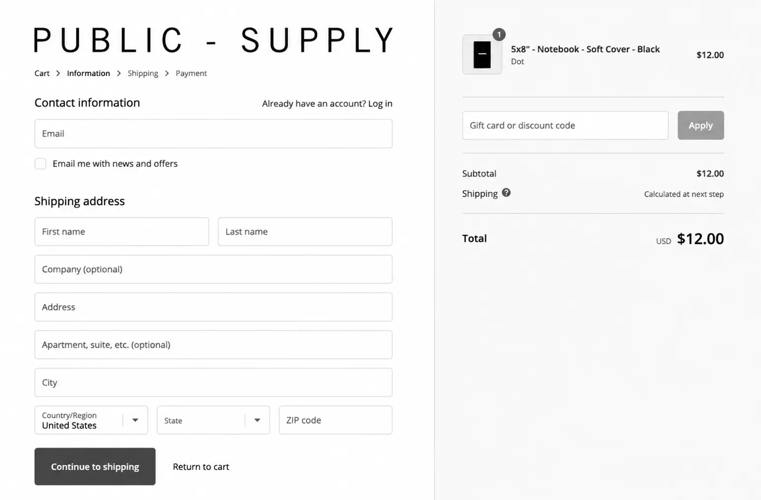
As per Baymard’s 2025 checkout benchmark, 62% of ecommerce sites fail to make Guest Checkout the most prominent option.
Consideration/tradeoff: Guest checkout speeds up conversion but reduces the first-party data you capture for remarketing and post-purchase email flows, since you don’t automatically get an account-linked profile.
3. Use Minimum Form Fields
What it solves: Long checkout forms create more opportunities for shoppers to hesitate, make mistakes, or abandon their purchase. Baymard found that the average US checkout presents 23.48 fields and elements by default, while most checkouts can remove 20%–60% of them without losing essential information.
How to implement it: Start by removing fields you don’t genuinely need for payment or fulfillment. Combine “First Name” and “Last Name” into a single “Full Name” field where appropriate, hide optional fields behind a link, and prefill information shoppers have already provided. Shopify’s address autocomplete can also fill address details after shoppers enter a few characters.
Consideration/tradeoff: Fewer fields should not mean removing useful information. Keep details that support delivery, order updates, fraud prevention, or customer service, but make them as easy as possible to complete.
Note: For returning customers, saved details through a signed-in account or Shop Pay can eliminate repeated manual entry, creating a faster path to payment.
4. Use Auto-Detect Address
What it solves: Manually typed addresses are slow and error-prone, and address errors cause failed or delayed deliveries.
How to implement it: Enable an address-autocomplete API (Shopify supports this natively in its checkout, and third-party tools like Google’s Address Validation API can be layered on for further verification) so the field suggests matches as the shopper types, then show a brief visual confirmation of the selected address before moving on.
Consideration/tradeoff: Autocomplete tools rely on third-party address databases that can be incomplete for rural or newly built addresses, so always leave a manual-entry fallback.
Example: Shopify’s native checkout includes address autocomplete by default for supported regions, reducing manual typing to a few keystrokes.
5. Implement 1-Click Checkout (Shop Pay)
What it solves: Returning customers shouldn’t have to re-enter payment and shipping information they’ve already given you once.
How to implement an address validation API:
- By using the Place Autocomplete Service, you can address entry flow.
- Use the Address Validation API to validate addresses.
- Provide your user with visual confirmation.
For instance:
Shopify positions Shop Pay as its fastest-converting checkout option, and third-party analysis of Shopify stores has found Shop Pay users abandon at meaningfully lower rates than guest-checkout users, largely because saved payment and address data removes most of the remaining friction.
2. Trust & Payment Tactics
1. Provide Multiple Payment Options
What it solves: A shopper who can’t pay the way they prefer will often leave rather than switch cards or find another method.
How to implement it: Map the payment methods your audience actually uses; major credit and debit cards, PayPal, and digital wallets like Apple Pay and Google Pay are the baseline for most Shopify stores in 2026. Enable these through Shopify Payments or a supported third-party gateway, test the flow on both mobile and desktop, and monitor payment-method-specific success rates in Shopify Analytics after launch.
As per the 2026 Global Payments Report, digital wallets account for 77% of ecommerce value in APAC, compared with 40% in the US, where cards remain the leading payment method.
Consideration/tradeoff: Every additional payment method adds a small amount of checkout-page complexity and, in some cases, additional processing fees, so add the two or three that match your actual customer base rather than every option available.
Example: Digital wallets have grown fast enough that Apple Pay and Google Pay are now standard expectations rather than differentiators for US-based Shopify stores, particularly on mobile, where wallet-based checkout removes manual card entry almost entirely.
2. Display Security Badges
What it solves: Payment-security concerns are a recurring, named reason shoppers cite for abandoning checkout, according to Baymard’s abandonment research.
How to implement it: Add recognizable trust marks, your SSL certificate indicator, accepted card network logos, and any third-party security seal you actually hold near the payment field and in the footer. Place at least one badge directly beside the field where customers enter card details, since that’s the moment security anxiety peaks.
Consideration/tradeoff: Badges only build trust if they’re real and verifiable; a generic “100% Secure” graphic with no underlying certification can look more suspicious than no badge at all to security-conscious shoppers.
For instance:
SSL certificate indicators and card-network logos (Visa, Mastercard, Amex) are the most universally recognized trust signals and are already generated automatically by Shopify’s checkout for stores on an SSL-enabled domain.
3. Use the Power of Testimonials
What it solves: New or unfamiliar shoppers need evidence that other real customers were satisfied before they’ll hand over payment details.
How to implement it: Surface short, specific customer reviews near the cart or checkout entry point, not just on product pages. Prioritize testimonials that mention concrete outcomes over generic praise, and refresh them periodically so they stay current.
Consideration/tradeoff: Testimonials placed directly inside the checkout flow can add visual clutter at the exact moment you want the page to feel fast and simple, so many stores place them one step earlier, on the cart page, instead.
Example: Reviews and star ratings displayed near the add-to-cart button are one of the most common social-proof placements among established Shopify stores.
3. Persuasion & Urgency Tactics
1. Write Clear Calls to Action
What it solves: Vague button labels can make shoppers pause because they are unsure what will happen next. Clear CTAs reduce that uncertainty and keep the checkout moving.
How to implement it: Use direct, descriptive labels such as “Continue to Payment,” “Review Order,” or “Place Order” instead of generic options like “Continue” or “Submit.” Keep one primary CTA visually dominant and make sure it is easy to find on mobile.
Consideration/tradeoff: Avoid overly aggressive wording that can make customers feel pressured. At checkout, the CTA should provide clarity and reassurance rather than create urgency.
Baymard’s checkout research found that 22% of ecommerce sites still require shoppers to click an “Apply” button to save information during checkout. Testing showed that shoppers often overlooked or misunderstood these buttons, creating unnecessary friction. Baymard recommends auto-applying standard form inputs and using a clear primary button to move shoppers to the next step.
2. Use FOMO (Fear of Missing Out)
What it solves: Without any urgency signal, shoppers have no reason to complete a purchase today rather than “later,” and later often means never.
How to implement it: Use low-stock indicators tied to real inventory data, time-limited offers with an accurate countdown, and abandoned-cart emails that reference the specific items left behind. Always tie urgency messaging to something true and verifiable.
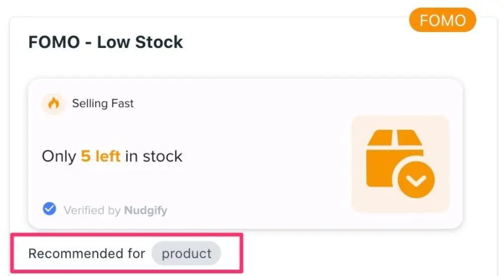
Consideration/tradeoff: FOMO tactics lose effectiveness and credibility fast if a “limited time” offer reappears every time the shopper visits or if a “low stock” warning shows for an item that’s clearly not low on stock.
Example: Genuine low-stock alerts, sourced directly from live inventory counts rather than a fixed countdown timer, are the version of this tactic least likely to damage trust when scrutinized.
Read More: How to Use FOMO in Your Content Marketing Strategy
3. Use Exit-Intent Popups
What it solves: Retains visitors who are about to leave the site before completing checkout.
How to implement it: Set a specific goal for the popup (discount code, newsletter signup, or a reminder of cart contents), install an exit-intent tool compatible with your Shopify theme (OptinMonster and Privy are common choices), configure the trigger to fire on upward mouse movement toward the browser bar, and make the close button obvious so it doesn’t feel like a trap. A/B test copy, design, and offer to find what actually reduces abandonment for your audience.
Consideration/tradeoff: Overly aggressive exit-intent popups can frustrate shoppers who were simply comparison-shopping in another tab, and heavy discounting through popups can train repeat customers to wait for a pop-up offer instead of buying at full price.
Example: A popup that simply reminds the visitor what’s still in their cart, without an added discount, is a lower-risk starting point than a blanket percentage-off offer.
4. Add Relevant Upsells and Cross-Sells
What it solves: Increases order value by suggesting useful products to shoppers who are already ready to buy.
How to implement it: Recommend products based on what the shopper is viewing or buying, such as accessories, add-ons, or frequently purchased items. Shopify also allows post-purchase offers, where customers can accept a relevant add-on with one tap without entering their payment details again.
Consideration/tradeoff: Avoid adding too many offers during checkout. Extra choices can distract shoppers and slow down the purchase, so keep recommendations relevant and test their placement.
Example:
Luggage brand Monos used Shopify Checkout Extensibility to add upsells such as protective covers and shipping insurance. The approach saved the team more than 10 hours of development time each month while allowing them to add relevant offers without custom checkout code.
4. Retention & Recovery Tactics
1. Send Abandoned Checkout Emails
What it solves: Recovers revenue from shoppers who left without completing their purchase.
How to implement it: Trigger the first email within one to a few hours of abandonment, keep the design simple and mobile-friendly, personalize the subject line and product images to match what was actually left in the cart, and consider a short follow-up sequence rather than a single email.
Consideration/tradeoff: Recovery-email effectiveness has been declining industry-wide as inbox privacy features (Apple Mail Privacy Protection, Gmail’s Promotions tab) reduce open-rate accuracy and deliverability, so email alone shouldn’t be your only recovery channel SMS and on-site retargeting are increasingly used alongside it.
Example:
Klaviyo’s platform benchmark data across more than 143,000 abandoned-cart email flows found a 50.5% average open rate and a 3.33% placed-order rate, both well above typical marketing-email benchmarks, which is why this remains one of the highest-yielding automated flows a Shopify store can set up.
2. Don’t Skip the Thank-You Page
The purchase is complete, but the customer is still engaged with your brand. A useful Thank You page can turn that moment into an opportunity for retention, feedback, or another purchase.
How to implement it: Start with a clear order confirmation, then add one relevant action such as order tracking, product reviews, loyalty rewards, reordering, returns, or a relevant cross-sell. Shopify’s new Thank You and Order Status pages support these types of customizations through built-in features and compatible apps.
Consideration/tradeoff: Keep the page focused. Adding too many promotions after payment can distract from important information such as order details, delivery updates, and return options.

Example:
Shopify’s new Order Status page includes a “Buy again” button by default, while its Thank You and Order Status page ecosystem also supports upsells, reviews, loyalty and referrals, order tracking, returns, and reordering. This makes the post-purchase experience useful for both customers and merchants.
5. Technical Performance: Page Speed
What it solves: Slow-loading checkout pages cause abandonment before a shopper even sees your design, payment options, or trust signals.
How to implement it:
- Compress and correctly size product images (serve WebP where possible) rather than relying on HTML to visually shrink oversized files.
- Audit installed apps and tracking scripts; each one adds load time, so remove anything that isn’t actively used.
- Enable browser caching and load non-critical JavaScript asynchronously so it doesn’t block page rendering.
- Minimize redirects and fix broken links, which add unnecessary round-trip requests.
Consideration/tradeoff: Some conversion-boosting apps (reviews widgets, personalization tools, chat widgets) also add load weight, so speed and feature-richness have to be balanced deliberately rather than assumed to both be free.
Ready to turn more Shopify visitors into customers? Get in touch with ResultFirst’s Shopify experts for a conversion-focused checkout review and actionable recommendations for your store.
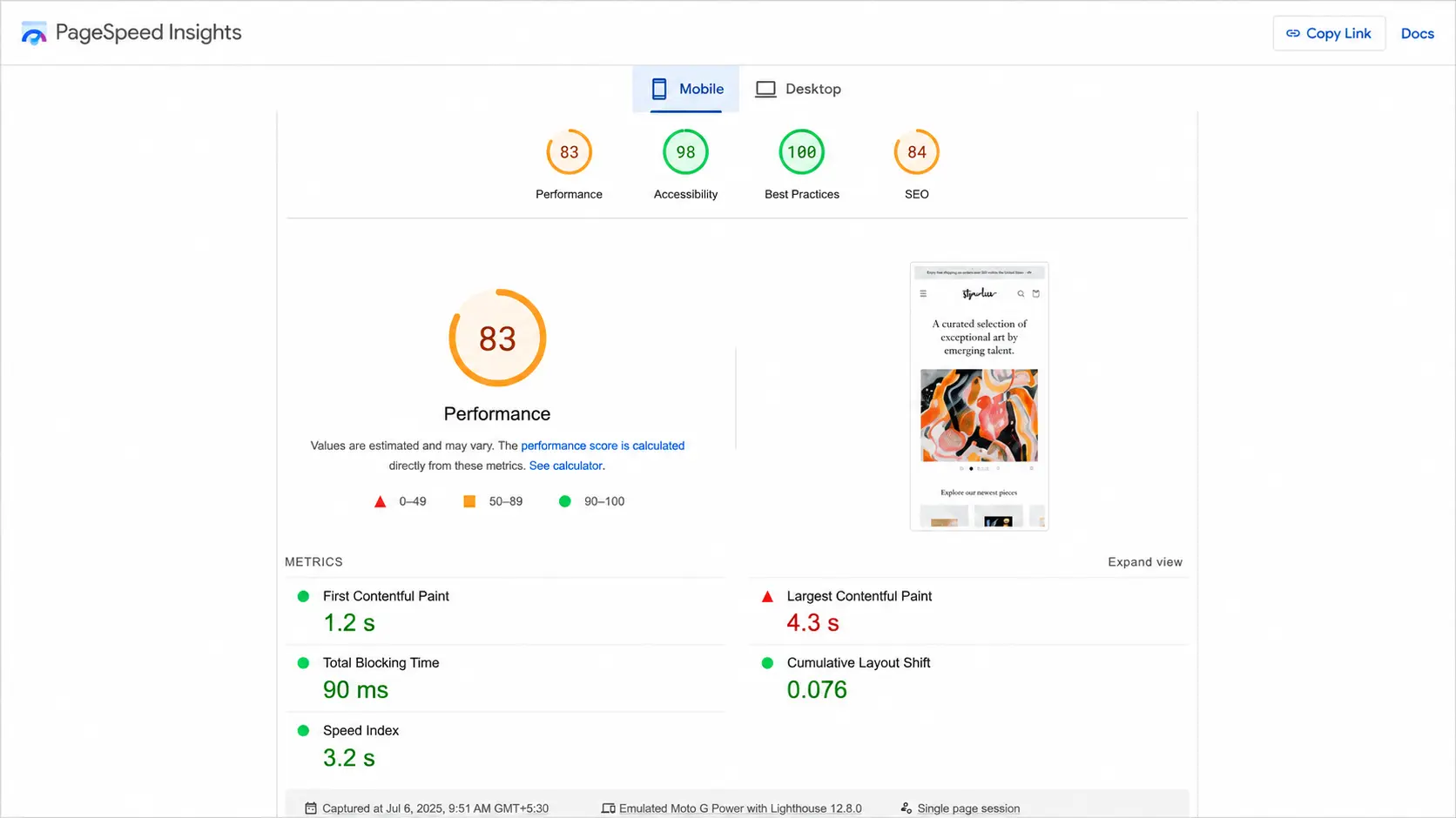
Shopify Checkout Optimization Checklist
| Tactic | Problem It Solves | Effort Level | Category |
| Guest checkout | Forced account creation friction | Low | UX & Flow |
| Minimum form fields | Slow, error-prone data entry | Low–Medium | UX & Flow |
| Auto-detect address | Manual address typing and errors | Medium | UX & Flow |
| 1-click checkout (Shop Pay) | Repeat-purchase friction | Low (Shopify-native) | UX & Flow |
| Multiple payment options | Preferred payment method missing | Medium | Trust & Payment |
| Security badges | Payment-security hesitation | Low | Trust & Payment |
| Customer testimonials | Lack of social proof | Low | Trust & Payment |
| Clear CTAs | Confusing or passive next steps | Low | Persuasion & Urgency |
| FOMO tactics | Low urgency to complete purchase | Low–Medium | Persuasion & Urgency |
| Exit-intent popups | Abandonment before checkout starts | Low | Persuasion & Urgency |
| Cross-sell / upsell | Lower average order value | Medium | Persuasion & Urgency |
| Abandoned checkout emails | Post-exit recovery | Low | Retention & Recovery |
| Thank-you page optimization | Missed post-purchase opportunity | Low | Retention & Recovery |
| Page speed optimization | Slow load times causing bounce | Medium–High | Technical Performance |
How to Measure Checkout Optimization Success
Track these metrics before and after each change, ideally through Shopify Analytics or a connected GA4 funnel:
- Checkout completion rate (sessions that start checkout ÷ sessions that finish it). Aggregated benchmarks across Shopify stores put a solid blended completion rate around 45–55%, with top-performing stores reaching 60–75%.
- Cart abandonment rate, split by device. If your mobile rate is running well above your desktop rate, prioritize the mobile checkout experience specifically rather than the desktop version.
- Site-wide conversion rate (sessions ÷ orders), useful for overall health but too broad on its own to diagnose a checkout-specific problem.
- Average order value, to track whether cross-sell, upsell, and speed improvements are increasing revenue per order, not just order count.
Change one variable at a time where possible, run each test long enough to reach statistical significance, and re-benchmark quarterly, Shopify’s own conversion averages and Baymard’s abandonment figures shift gradually as checkout norms evolve.
Conclusion
Shopify checkout optimization is less about adding more features and more about removing the reasons customers hesitate before paying. Start with the biggest friction point, guest checkout, fewer form fields, preferred payment methods, clear costs, and mobile performance, then use trust signals and recovery tactics to capture missed sales. Measure checkout completion, abandonment, and AOV after each change rather than making multiple changes at once. A faster, clearer, and more trustworthy checkout can turn more of the shoppers you already have into paying customers.
Drive More Qualified Traffic and Conversions With Shopify SEO
A high-converting checkout works best when the right shoppers are reaching your store in the first place. ResultFirst combines performance-driven SEO with a conversion-focused approach to help Shopify brands improve search visibility, attract high-intent customers, and turn more organic traffic into revenue.
Our SEO services for Shopify stores cover technical SEO, product and collection optimization, content, internal linking, and other search strategies designed around measurable business outcomes, not just rankings and traffic.
Sources Referenced:
- https://baymard.com/lists/cart-abandonment-rate/
- https://baymard.com/research/checkout-usability/
- https://www.shopify.com/case-studies/everlane
- https://research.google/blog/users-love-simple-and-familiar-designs-why-websites-need-to-make-a-great-first-impression/
- https://baymard.com/blog/current-state-of-checkout-ux/
- https://baymard.com/learn/ux-statistics/
- https://www.shopify.com/blog/what-is-ssl-certificate/
- https://baymard.com/blog/checkout-usability-apply-buttons/
- https://www.shopify.com/case-studies/monos/
- https://www.klaviyo.com/blog/abandoned-cart-benchmarks/
- https://help.shopify.com/en/manual/checkout-settings/customize-checkout-configurations/upgrade-thank-you-order-status/customization-options/
FAQs:
WHAT TO READ NEXT
READY TO BUILD PREDICTABLE ORGANIC GROWTH?
We are the only TOP SEO services agency providing Real Results in a Real Performance model. We help growth hungry companies outperform their competition and achieve 300%+ growth in their digital marketing initiatives.
- San Jose, CA, 95120

- +1-888-512-1890

- sales@resultfirst.com

300K+
KEYWORDS RANKED
546M+
REVENUE GENERATED
18 Years
SOLVING COMPLEX SEO
150+
TEAM MEMBERS